Effective data visualization is not just about presenting data but telling a clear, truthful story that guides viewers to key insights efficiently and accurately.
Good design principles focus on structuring visuals to maximize understanding and retention by combining visual hierarchy, color theory, clarity, and accessibility.
Applying these principles avoids common pitfalls and creates inclusive visual experiences, supporting data-driven decisions for diverse audiences.
Visual Hierarchy: Guiding Audience Attention to Key Insights
Visual hierarchy guides the audience’s attention to the most important insights by establishing a clear and logical flow.
It uses elements such as size, position, contrast, and spacing to highlight key data points, with larger and bolder components drawing focus while less critical details remain subdued.
Titles, labels, and annotations act as contextual markers, helping viewers understand the information quickly.
For example, dashboards often place KPIs or summary metrics prominently, with supporting charts arranged in secondary positions. By directing attention effectively, visual hierarchy reduces cognitive overload and speeds up insight delivery.
Color Theory and Design: Using Visuals to Enhance Message Clarity
Color theory and design play a key role in enhancing message clarity by using visuals that convey meaning without overwhelming the viewer.
Consistent color schemes aligned with brand guidelines or context help maintain coherence, while avoiding excessive colors prevents distraction.
Gradients are useful for representing quantitative data, such as in heatmaps, whereas distinct hues work well for categorical variables.
Ensuring high contrast improves readability, and choosing color-blind friendly palettes—such as avoiding red-green combinations—supports accessibility.
Colors can also group related data, highlight trends, or signal thresholds when applied subtly. Thoughtful color design strengthens both clarity and emotional impact in data storytelling.
Avoiding Common Visualization Pitfalls: Misleading Scales and Chart Junk
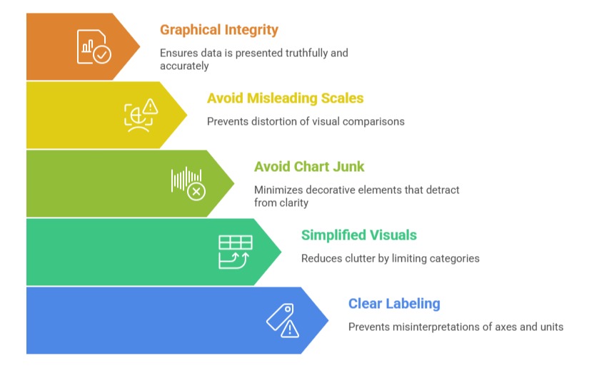
Avoiding common visualization pitfalls is essential for maintaining clarity and trustworthiness in data communication. Misleading scales—such as truncated axes or non-zero baselines—should be avoided because they distort visual comparisons.
Likewise, 3D effects and unnecessary decorative elements, known as chart junk, detract from clarity and should be minimized. Reducing clutter by limiting categories and simplifying visuals helps audiences interpret information more easily.
Clear labeling of axes and units prevents misinterpretations, and reviewing charts for graphical integrity ensures that data is presented truthfully and accurately. Preventing these pitfalls strengthens both comprehension and credibility.
Accessibility and Inclusive Design Principles in Data Visualization
Accessibility and inclusive design principles in data visualization ensure that insights are understandable and usable for all audiences.
This includes choosing colors that accommodate viewers with color vision deficiencies, supported by accessible palettes or tools.
Readable fonts with sufficient size and contrast enhance visual clarity, while alternative text descriptions and data tables make visualizations compatible with screen readers.
Providing keyboard-friendly navigation supports users with limited motor skills, and testing visuals with diverse users helps identify and remove accessibility barriers.
By following these principles, organizations broaden the impact of their visualizations and meet both ethical and legal accessibility standards.