Data visualization is a vital aspect of data analysis, transforming raw data into visual formats that are easier to understand and interpret.
Using appropriate chart types and visual techniques, data visualization helps identify patterns, trends, and outliers, making complex datasets more accessible for decision-making.
Effective visualizations are clear, impactful, and tailored to the specific insights they aim to communicate.
Chart Types and Their Appropriate Use Cases
Different visualization types serve various analytical purposes, each suited for specific data or insights:
1. Bar Charts: Ideal for comparing quantities across different categories, such as sales per product or revenue per region. They can be vertical or horizontal.
2. Line Charts: Suitable for showing trends over time, such as stock prices or monthly sales growth, by connecting data points with a continuous line.
3. Scatter Plots: Used to display relationships or correlations between two variables, such as height vs. weight or advertising spend vs. sales.
4. Histograms: Help visualize the distribution of a dataset, showing the frequency of data points within specified ranges or bins.
5. Heatmaps: Use color gradients to show the intensity or density of data points across two variables, such as customer activity by region and time.
Other advanced visualizations include pie charts, bubble charts, geographic maps, network diagrams, and hierarchical tree structures like dendrograms, each serving specific analytical needs.
Creating Effective Pivot Tables for Summarization and Exploration
Pivot tables are powerful tools in spreadsheet software like Excel or Google Sheets that enable users to quickly summarize, analyze, and explore data:
1. Row and Column Grouping: Organize data along categories, such as products, regions, or time periods.
2. Aggregation Functions: Summarize data using SUM, COUNT, AVERAGE, MAX, MIN.
3. Filtering: Focus on specific data subsets.
4. Calculations: Add calculated fields to derive new insights, such as profit margins or growth rates.
5. Slicers and Timelines: Enhance interactivity for dynamic filtering and temporal analysis.
Effective pivot tables help identify key patterns and facilitate interactive data exploration for stakeholders.
Graphical Techniques for Pattern Identification
Data visualization techniques reveal hidden insights within datasets:
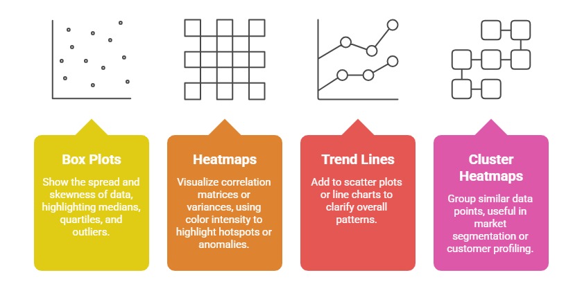
These techniques allow users to quickly detect outliers, clusters, and trends that inform decision-making.
Dashboard Design Principles: Clarity, Actionability, and Interactive Elements
Designing effective dashboards ensures data is presented clearly and drives action:
1. Clarity: Use simple, clean layouts with minimal clutter. Highlight key KPIs prominently.
2. Actionability: Incorporate alerts, targets, and filters that enable users to explore data and act accordingly.
3. Interactivity: Use dropdowns, sliders, and drill-down features to explore different dimensions.
4. Consistency: Maintain uniform color schemes, fonts, and formats.
5. Responsiveness: Ensure dashboards are accessible on various devices and screen sizes.
A well-designed dashboard enables quick insights, supports strategic decisions, and encourages data-driven culture.

Class Sessions
Sales Campaign

We have a sales campaign on our promoted courses and products. You can purchase 1 products at a discounted price up to 15% discount.