In data analysis, understanding how variables relate to one another is just as important as understanding each variable individually. Knowing that sales increased last quarter is useful, but knowing that sales increased because marketing spend increased, or that they tend to rise whenever customer satisfaction scores improve, is far more powerful.
Correlation is the statistical concept that formalizes this idea of relationship between variables. It tells you whether two variables move together, move in opposite directions, or have no consistent relationship at all.
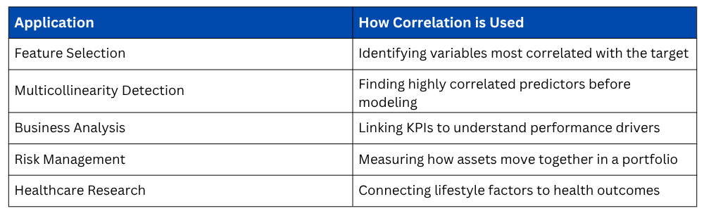
For any data analyst, correlation is one of the most frequently used and most practically valuable concepts in the entire statistical toolkit, applied in everything from business analysis and financial modeling to healthcare research and machine learning feature selection.
What is Correlation?
Correlation is a statistical measure that describes the strength and direction of a linear relationship between two numerical variables. It answers a simple but critical question: "When one variable changes, what tends to happen to the other?"
It is important to establish right away that correlation is a measure of association, not causation. Two variables can be strongly correlated without one causing the other, a distinction that separates good analysis from misleading conclusions.
Direction of Correlation
The direction of a correlation tells you how two variables move in relation to each other.
1. Positive Correlation: Both variables move in the same direction. When one increases, the other tends to increase as well. Example: hours studied and exam scores, advertising spend and revenue.
2. Negative Correlation: Variables move in opposite directions. When one increases, the other tends to decrease. Example: price and demand, stress levels and sleep quality.
3. No Correlation: There is no consistent directional relationship between the two variables. Changes in one variable give no information about the other. Example: a person's name length and their income.
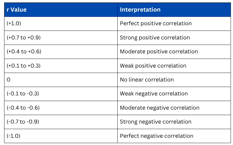
The Pearson Correlation Coefficient
The most widely used measure of correlation is the Pearson Correlation Coefficient (r), which quantifies both the strength and direction of a linear relationship between two continuous variables. Its value always falls between -1 and +1.

Interpreting the value of r

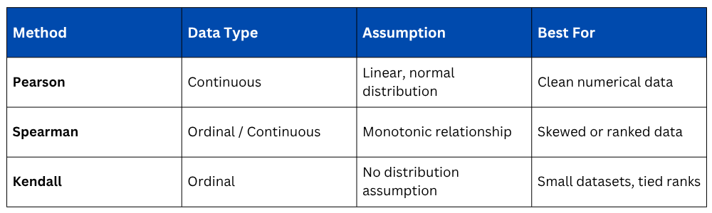
Types of Correlation Methods
Pearson is not the only correlation method available. The right choice depends on the nature and distribution of your data.
1. Pearson Correlation assumes that both variables are continuous and approximately normally distributed, and that their relationship is linear. It is the standard choice for clean, well-distributed numerical data.
2. Spearman Rank Correlation does not assume normality or linearity. Instead of using raw values, it ranks the data points and measures the correlation between those ranks. It is ideal for ordinal data, skewed distributions, or when the relationship between variables is monotonic but not strictly linear.

Where di is the difference between the ranks of corresponding values.
3. Kendall Rank Correlation is another rank-based method, more robust than Spearman for small datasets or data with many tied ranks. It measures the proportion of concordant versus discordant pairs in the data.

Choosing the Right Method
Correlation Matrix — Analyzing Multiple Variables
When a dataset contains several numerical variables, computing a pairwise correlation matrix gives you the correlation between every possible pair of variables simultaneously — an essential tool during Exploratory Data Analysis.

The diagonal of any correlation matrix always equals 1.0 because every variable is perfectly correlated with itself. The values above and below the diagonal mirror each other, as the correlation between X and Y is identical to the correlation between Y and X.
Visualizing Correlation
Numbers in a correlation matrix are informative, but visual representations make patterns immediately obvious and far easier to communicate.
1. Heatmap — The Standard Correlation Visual
A heatmap color-codes the correlation matrix, making it effortless to spot strong, weak, positive, and negative relationships across all variable pairs at a single glance.

2. Scatter Plot — Visualizing a Single Relationship
For examining the relationship between two specific variables, a scatter plot remains the clearest and most direct visual tool.

3. Pair Plot — EDA Across All Variable Pairs
A pair plot generates scatter plots for every combination of numerical variables in a single command, providing a comprehensive visual overview of all pairwise relationships.

Correlation vs. Causation — The Most Critical Distinction
This distinction cannot be overstated in data analysis. Correlation does not imply causation. Two variables may be strongly correlated for reasons that have nothing to do with a direct causal link.
A well-known example — research has shown a strong positive correlation between the number of Nicolas Cage films released per year and the number of swimming pool drownings.
Clearly, one does not cause the other. Both happen to follow similar patterns for entirely unrelated reasons. This is called a spurious correlation.
Three possible explanations always exist when a correlation is observed:
1. A causes B — a direct causal relationship.
2. B causes A — the causation runs in the opposite direction.
3. A third variable C causes both A and B — known as a confounding variable.
Establishing true causation requires controlled experiments or advanced causal inference techniques, not correlation alone.
Limitations of Correlation
Understanding what correlation cannot do is just as important as knowing what it can.
1. Only detects linear relationships: Pearson correlation will show near-zero for a strong curved (non-linear) relationship even when one clearly exists.
2. Sensitive to outliers: A single extreme data point can significantly inflate or deflate the correlation coefficient.
3. Does not indicate importance: A strong correlation does not automatically mean the variable is important or useful for your analysis.
4. Scale independent but context dependent: A correlation of 0.4 might be highly significant in social science research but considered weak in a physics experiment.