Before performing any analysis, building any model, or drawing any conclusions, you need to understand how your data is distributed.
A data distribution describes how values in a dataset are spread across a range, where most values cluster, how wide the spread is, and whether the data is symmetric or skewed.
Skipping this step often leads to choosing the wrong statistical methods or misinterpreting results entirely.
Understanding distribution is not just a preliminary check, it is one of the most informative steps in the entire data analysis process.
What is a Data Distribution?
A distribution tells you the frequency of each value or range of values within a dataset. When you plot a distribution, you can immediately see the shape of your data — whether values pile up in the center, lean to one side, or spread out evenly.
This shape directly influences which statistical summaries are meaningful and which analytical techniques are appropriate.
Consider two datasets both with a mean of 50 — one could be tightly clustered between 45 and 55, while the other could range from 0 to 100. The mean alone tells you nothing about this difference. The distribution shows you the full picture.
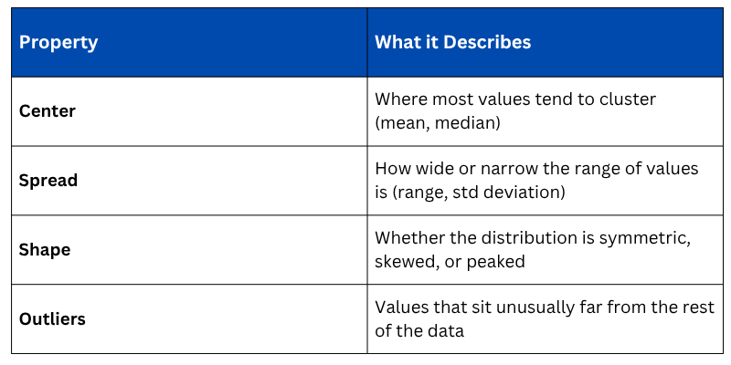
Key Properties of a Distribution
Every distribution can be described by four core properties that together paint a complete picture of your data.
Types of Data Distributions
1. Normal Distribution (Bell Curve)
The normal distribution is the most important and commonly encountered distribution in statistics. Values are symmetrically distributed around the mean, forming a classic bell shape. Most values cluster near the center, and fewer values appear as you move toward the extremes.
.png)
Key characteristics of a normal distribution — the mean, median, and mode are all equal, and approximately 68% of values fall within one standard deviation of the mean.
2. Skewed Distribution
A skewed distribution is asymmetric — the tail of the distribution stretches longer on one side than the other. This is one of the most common patterns in real-world data.
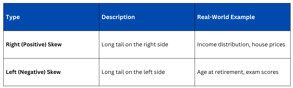
In a right-skewed distribution, the mean is pulled higher than the median by the extreme high values, making the median a more reliable measure of center. This is exactly why median income is reported instead of mean income in economics.

3. Uniform Distribution
In a uniform distribution, all values occur with roughly equal frequency across the entire range. There is no peak or cluster — the distribution appears flat.
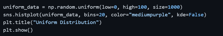
A uniform distribution rarely occurs naturally in business or social data but is common in simulations, random sampling, and gaming scenarios.
4. Bimodal Distribution
A bimodal distribution has two distinct peaks, suggesting that the dataset contains two different subgroups with different typical values. Treating this as a single distribution without investigating the underlying groups leads to misleading analysis.
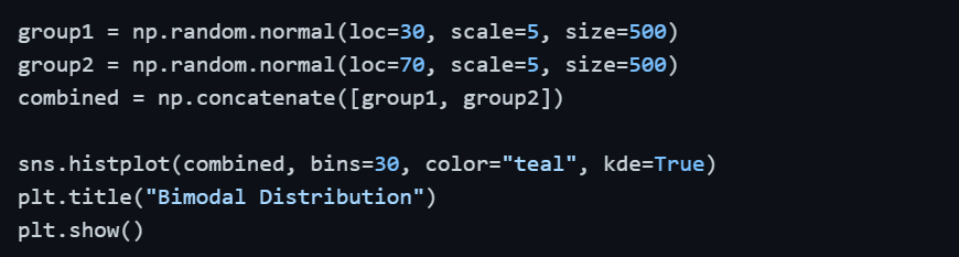
If you encounter a bimodal distribution, investigate whether the data should be segmented into two separate groups before continuing the analysis.
Visualizing Distributions in Python
Different visualization tools reveal different aspects of a distribution. Using more than one is always a good practice.
1. Histogram — Shows frequency of values across bins, revealing overall shape.
.png)
2. KDE Plot (Kernel Density Estimate) — A smooth curve that shows the probability density of the data without the rigid bin structure of a histogram.
.png)
3. Box Plot — Displays median, interquartile range (IQR), and outliers in a compact format. Ideal for comparing distributions across categories.

4. Violin Plot — Combines a box plot with a KDE curve, showing both the summary statistics and the full shape of the distribution simultaneously.

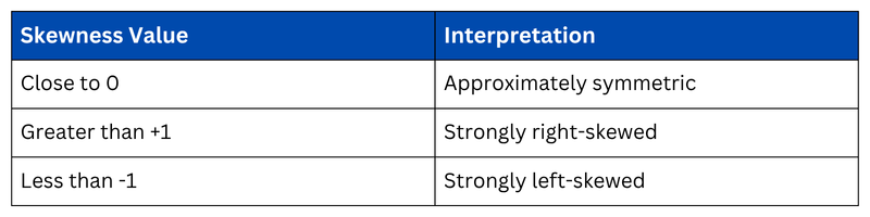
Checking Skewness and Kurtosis Numerically
Beyond visual inspection, you can quantify the shape of a distribution using two statistical measures.
Skewness measures the asymmetry of the distribution. A value of 0 indicates perfect symmetry, positive values indicate right skew, and negative values indicate left skew.
Kurtosis measures the "peakedness" of the distribution and how heavy the tails are. High kurtosis means more extreme outliers are present.

Why Distribution Shape Matters for Analysis
Understanding distribution shape is not just academic, it has direct practical consequences for how you analyze data.
1. Choosing the right average: In skewed data, the median is more representative than the mean.
2. Selecting statistical tests: Many tests (like t-tests) assume normality. Violating this assumption without checking leads to unreliable results.
3. Scaling and transformation: Highly skewed data often needs a log transformation before being used in machine learning models.
4. Detecting data quality issues: An unexpected distribution shape can reveal data entry errors, sampling problems, or missing values.

Class Sessions
Sales Campaign

We have a sales campaign on our promoted courses and products. You can purchase 1 products at a discounted price up to 15% discount.