After exploring a dataset like cleaning it, visualizing distributions, detecting outliers, and analyzing correlations; the final and arguably most important step of Exploratory Data Analysis is summarizing what you have actually found.
Raw observations and individual charts are valuable, but they only become useful when translated into clear, organized insights that can guide decisions.
Summarizing insights means distilling everything your analysis has revealed into concise, meaningful conclusions that answer the original questions you set out to investigate.
A well-structured summary transforms your analytical work from a collection of charts and numbers into a coherent story that both technical and non-technical audiences can act upon.
What Does Summarizing Insights Mean?
Summarizing insights is the process of consolidating the key findings from your entire EDA into structured, actionable conclusions. It is not about repeating every step you took — it is about answering the question: "What does this data actually tell us?"
A strong insight summary typically covers:
1. What patterns were found — trends, seasonal behavior, growth, or decline.
2. What anomalies exist — outliers, missing data issues, or unexpected values.
3. What relationships matter — which variables are strongly correlated.
4. What the data confirms or contradicts — validating or challenging initial assumptions.
5. What needs further investigation — gaps or questions the EDA raised but could not fully answer.
Using Pandas to Generate Statistical Summaries
Before writing narrative insights, Python gives you powerful tools to generate numerical summaries quickly. These summaries form the factual foundation of your conclusions.
.describe() — The Quick Statistical Snapshot
The .describe() method provides count, mean, standard deviation, min, max, and quartile values for every numerical column, a solid starting point for summarizing data behavior.
 — The Quick Statistical Snapshot.png)
.value_counts() — Summarizing Categorical Data
For categorical columns, .value_counts() shows how frequently each category appears, immediately revealing dominant groups or rare categories.
 — Summarizing Categorical Data.png)
.groupby() — Summarizing by Group
Group-level summaries are often the most insightful. Comparing averages, totals, or counts across groups reveals differences that overall statistics hide.
 — Summarizing by Group.png)
.corr() — Summarizing Relationships
A final correlation summary captures which variable pairs have meaningful relationships worth highlighting in your conclusions.
 — Summarizing Relationships.png)
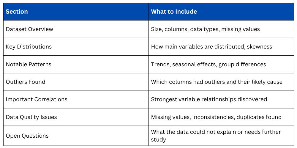
Structuring Your Insight Summary
A well-organized insight summary follows a logical structure that moves from general observations to specific findings to recommended next steps.
Translating Numbers into Language
The most overlooked skill in data analysis is converting statistical findings into plain, meaningful language. A number on its own means very little, the interpretation is what creates value.
Consider these examples of weak versus strong insight statements:
1. Weak → "The mean salary is 72,000."
Strong → "The average salary is $72,000, but the wide standard deviation of $18,000 and a maximum of $210,000 suggest significant pay disparity across departments — particularly in Engineering and Sales."
2. Weak → "Experience and salary are correlated."
Strong → "Experience and salary show a strong positive correlation of 0.83, indicating that years of experience is one of the most reliable predictors of compensation in this dataset."
Every insight should answer three things- what was found, how significant it is, and why it matters.
Presenting Insights Effectively
How you present your summary is just as important as the content itself. Depending on your audience, the format will vary.
1. For technical teams: Include the code, statistical values, and visualizations alongside written conclusions.
2. For business stakeholders: Lead with the key findings in plain language, supported by clean charts. Avoid raw code and excessive statistics.
3. For reports and documentation: Use a structured format with section headings, summary tables, and annotated visualizations.
Regardless of the audience, every insight summary should be supported by at least one visual, a chart always makes a conclusion more persuasive and easier to remember than numbers alone.
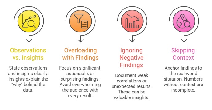
Common Mistakes to Avoid

Class Sessions
Sales Campaign

We have a sales campaign on our promoted courses and products. You can purchase 1 products at a discounted price up to 15% discount.