In data analysis, rarely does a single variable tell the complete story. Most real-world phenomena are shaped by the interaction between multiple variables — sales figures are influenced by marketing spend, student performance is linked to study hours, and house prices are driven by location, size, and age.
Understanding how variables relate to one another is at the heart of meaningful data analysis. Correlation is the statistical measure that quantifies the strength and direction of a relationship between two variables.
Identifying these relationships helps analysts make predictions, uncover hidden patterns, and build stronger data-driven decisions.
What is Correlation?
Correlation measures how closely two variables move together. When one variable changes, does the other change in a predictable way? The answer to that question defines the nature of their relationship.
There are three types of correlation:
1. Positive Correlation: Both variables move in the same direction. As one increases, the other increases too (e.g., study hours and exam scores).
2. Negative Correlation: Variables move in opposite directions. As one increases, the other decreases (e.g., price and demand).
3. No Correlation: There is no predictable relationship between the two variables (e.g., shoe size and intelligence).
The Correlation Coefficient
The strength and direction of a correlation is measured by the Pearson Correlation Coefficient (r), which always falls between -1 and +1.

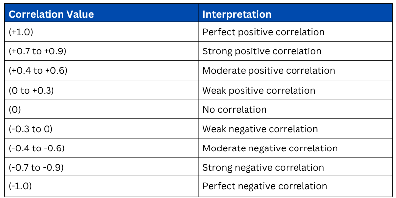
The closer the value is to +1 or -1, the stronger the relationship. A value near 0 means the variables have little to no linear relationship.
Correlation vs. Causation
This is one of the most important concepts in data analysis. Correlation does not imply causation. Just because two variables are correlated does not mean one causes the other.
A classic example — ice cream sales and drowning incidents are positively correlated. Does eating ice cream cause drowning? Absolutely not. Both are driven by a third variable, hot weather. This hidden driver is called a confounding variable.
Always question the reason behind a correlation before drawing conclusions from it.
Visualizing Relationships Between Variables
Numbers alone cannot always reveal the full picture of a relationship. Visual tools make correlations immediately understandable.
1. Scatter Plot — The Primary Tool for Correlation
A scatter plot places each observation as a dot on a two-axis grid, making the direction and strength of a relationship visually obvious.
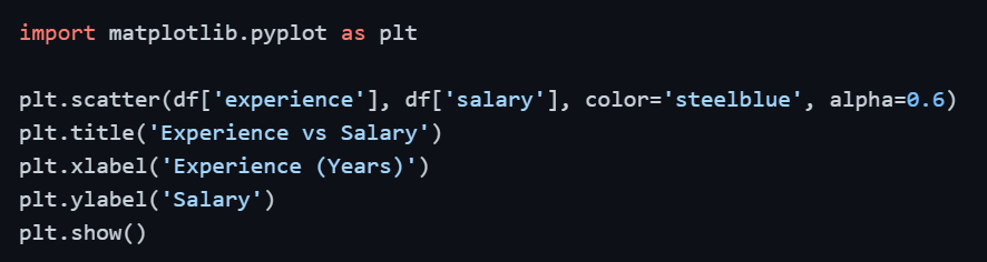
A clear upward diagonal pattern signals a positive correlation. A downward pattern signals a negative correlation. A random scatter signals no correlation.
2. Correlation Matrix — Measuring All Variable Pairs
When working with multiple variables, computing a correlation matrix gives you the correlation value between every possible pair of variables at once.

3. Heatmap — Visualizing the Correlation Matrix
A heatmap turns the correlation matrix into a color-coded grid, making it effortless to spot strong and weak relationships across all variable pairs simultaneously.

1. Dark red cells indicate strong positive correlation.
2. Dark blue cells indicate strong negative correlation.
3. Light or white cells indicate weak or no correlation.
4. The diagonal always shows a value of 1.0 — every variable is perfectly correlated with itself.
4. Pair Plot — EDA Across Multiple Variables
A pair plot generates scatter plots for every combination of numerical variables in your dataset in a single command, extremely useful during exploratory data analysis.

This gives you a quick visual overview of all pairwise relationships, distributions, and potential correlations across the entire dataset in one go.
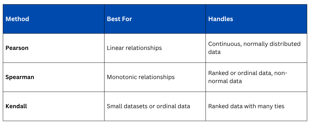
Types of Correlation Methods
Pearson is not the only way to measure correlation. The right method depends on the nature of your data.

Interpreting Correlation in Practice
Correlation values alone need careful interpretation in a real-world context.
1. A correlation of 0.85 between marketing spend and revenue strongly suggests that increasing the marketing budget is associated with higher revenue, worth investigating further.
2. A correlation of 0.10 between employee age and productivity suggests age has very little linear relationship with how productive someone is.
3. A negative correlation of -0.75 between customer complaints and satisfaction scores confirms that more complaints are strongly associated with lower satisfaction, an actionable insight.

Class Sessions
Sales Campaign

We have a sales campaign on our promoted courses and products. You can purchase 1 products at a discounted price up to 15% discount.