Data visualization is the practice of representing data graphically, through charts, graphs, plots, and other visual formats so that patterns, trends, relationships, and outliers become immediately visible.
The human brain processes visual information far more efficiently than raw numbers, making visualization one of the most powerful tools in a data analyst's toolkit.
Whether you are exploring a new dataset, communicating findings to a non-technical audience, or building a dashboard for business decisions, data visualization bridges the gap between raw data and meaningful understanding.
Why Visualization Matters in Data Analysis
Data analysis without visualization is like reading a map without being able to see it. You might have all the right information, but extracting meaning from it becomes unnecessarily difficult.
Visualization transforms complex data into something human-readable and actionable.
Example
Raw Data Table
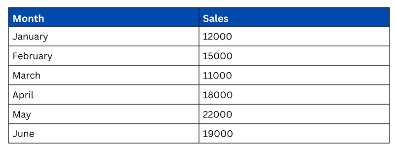
Or a line chart showing a clear upward sales trend from January to May with a slight dip in June? The chart communicates the same information in seconds, no mental calculation required.
Key Reasons Why Data Visualization is Essential
1. Faster Pattern Recognition
The human visual system is wired to detect patterns, shapes, and anomalies almost instantly.
A trend that might take minutes to spot in a table becomes obvious within seconds on a chart. Line graphs reveal growth trends, bar charts highlight comparisons, and scatter plots expose relationships.
2. Identifying Outliers and Anomalies
Outliers hidden deep within rows of numbers are easy to miss. On a scatter plot or box plot, a data point sitting far away from the rest immediately draws the eye.
Early detection of outliers is critical because they can either represent data errors that need fixing or genuinely important discoveries worth investigating.
3. Understanding Data Distributions
A single mean value tells you very little about how data is spread.
A histogram or box plot, on the other hand, instantly shows whether data is normally distributed, heavily skewed, or concentrated in a narrow range — information that directly influences which statistical methods and models are appropriate.
4. Communicating Insights Clearly
Data analysts rarely work in isolation. Findings need to be shared with managers, clients, or teams who may not have a technical background.
A well-designed chart communicates conclusions clearly and persuasively without requiring the audience to interpret raw numbers. Visualization is essentially the language that translates data into decisions.
5. Supporting Exploratory Data Analysis (EDA)
Before building any model or drawing conclusions, analysts explore their data visually to understand its structure.
This exploratory phase, where you plot distributions, check correlations, and compare groups — would be significantly harder and slower without visualization tools.
6. Revealing Relationships Between Variables
Correlation tables show numbers, but a scatter plot shows the actual shape of a relationship, whether it is linear, curved, clustered, or nonexistent. Visualization makes relationships between variables intuitive and immediately understandable.
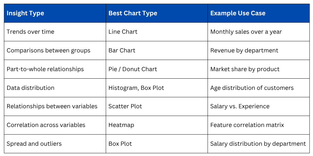
Types of Insights Visualization Reveals
Different chart types are designed to reveal different kinds of insights. Choosing the right chart for your data and question is just as important as the visualization itself.
Visualization in the Data Analysis Workflow
Data visualization is not just a final presentation step, it is embedded throughout the entire analysis process.
1. Before Analysis (EDA): Visualize distributions, spot missing patterns, and understand data shape before cleaning or modeling.
2. During Analysis: Plot intermediate results to verify assumptions and guide analytical decisions.
3. After Analysis: Communicate final insights, trends, and recommendations to stakeholders through clear, well-labeled charts.
Treating visualization as an end-to-end tool, rather than just a reporting step — leads to better analysis decisions and fewer surprises late in the process.
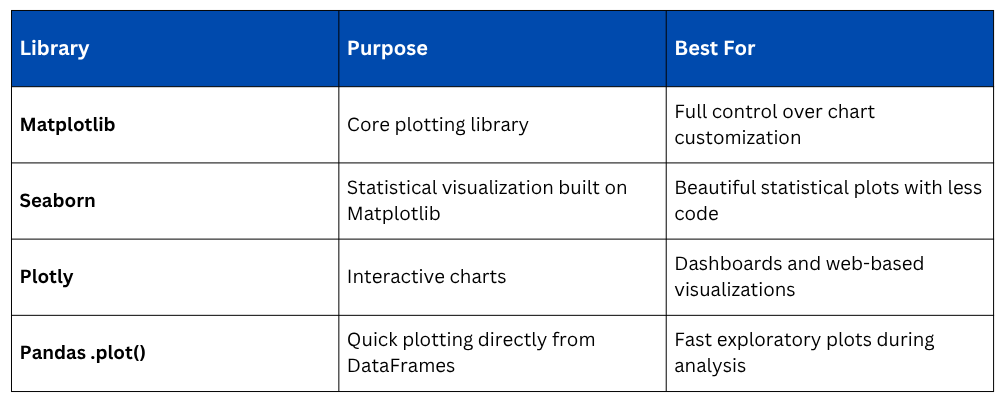
Visualization Tools in Python
Python offers a rich ecosystem of visualization libraries, each serving a different purpose and level of complexity.
Good Visualization Principles
Creating a chart is easy, creating a clear and honest chart requires deliberate effort. Poor visualizations mislead audiences, even unintentionally.
1. Label everything: Every axis, title, and legend should be clearly labeled so the chart stands alone without explanation.
2. Choose the right chart type: Using a pie chart for 10 categories or a line chart for unordered categories creates confusion rather than clarity.
3. Avoid clutter: Too many colors, gridlines, or data series overwhelm the viewer and dilute the message.
4. Keep scales honest: Truncating a Y-axis or using inconsistent scales can exaggerate or minimize differences misleadingly.
5. Use color purposefully: Color should highlight differences or categories, not just decorate. Consider color-blind-friendly palettes.

Class Sessions
Sales Campaign

We have a sales campaign on our promoted courses and products. You can purchase 1 products at a discounted price up to 15% discount.