One of the core purposes of data analysis is to move beyond raw numbers and uncover the story hidden within the data. Patterns and trends are that story.
A pattern is a recurring structure or regularity in data, something that repeats predictably across observations. A trend is a consistent directional movement in data over time, values that are steadily rising, falling, or plateauing.
Identifying these signals early in the analysis process guides every decision that follows, from feature selection in machine learning to business strategy recommendations. Without this step, analysis risks being reactive rather than insightful.
Patterns vs. Trends — Understanding the Difference
Both terms are often used interchangeably, but they describe different things. Understanding the distinction helps you ask the right questions about your data.
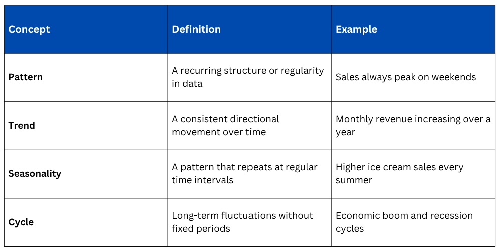
Patterns can exist within a single snapshot of data, while trends are observed across time. Both require visualization and statistical tools to detect reliably.
Step 1: Start with Visual Exploration
The fastest and most intuitive way to identify patterns and trends is through visualization. Plotting your data before applying any statistical technique often reveals insights that numbers alone would hide.
Line Plot for Time-Based Trends
A line chart is the primary tool for spotting directional trends in time-series data. The slope and shape of the line immediately communicate whether values are rising, falling, or staying flat.
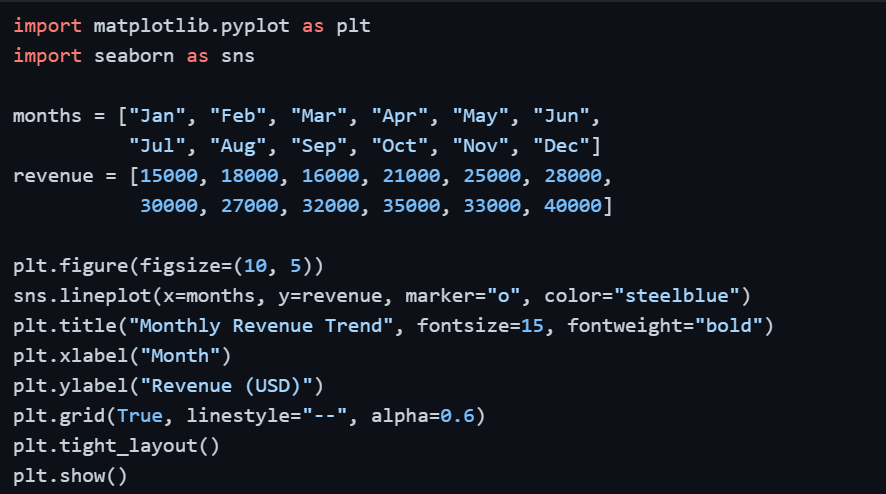
A rising line from January to December immediately signals consistent business growth — no calculation required at this stage.
Step 2: Detect Seasonality and Repeating Patterns
Seasonality is a specific type of pattern where the same fluctuation repeats at regular intervals — weekly, monthly, or annually. It is one of the most common and practically important patterns in business data.
Bar Chart for Seasonal Comparisons
Comparing the same time period across multiple years side by side reveals whether a pattern is genuinely seasonal or just a one-time occurrence.
import numpy as np
quarters = ["Q1", "Q2", "Q3", "Q4"]
sales_2023 = [20000, 35000, 28000, 45000]
sales_2024 = [22000, 37000, 30000, 50000]
x = np.arange(len(quarters))
width = 0.35
plt.figure(figsize=(9, 5))
plt.bar(x - width/2, sales_2023, width, label="2023", color="steelblue")
plt.bar(x + width/2, sales_2024, width, label="2024", color="coral")
plt.xticks(x, quarters)
plt.title("Quarterly Sales Comparison — 2023 vs 2024")
plt.xlabel("Quarter")
plt.ylabel("Sales (USD)")
plt.legend()
plt.tight_layout()
plt.show()
If Q4 consistently outperforms other quarters across both years, that is a confirmed seasonal pattern, not a coincidence.
Step 3: Explore Relationships Between Variables
Patterns do not only exist within a single variable, they also emerge between two or more variables. A scatter plot is the most direct way to examine whether a relationship exists between two numerical variables.
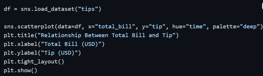
If the scatter plot shows points moving upward from left to right, that is a positive pattern, higher bills tend to result in higher tips. The hue parameter adds an extra layer, allowing you to spot whether this pattern differs between lunch and dinner.
Step 4: Use a Heatmap to Spot Patterns Across Multiple Variables
When you have several numerical variables, examining relationships one pair at a time becomes inefficient. A correlation heatmap displays all pairwise relationships simultaneously, making it easy to spot which variables move together.
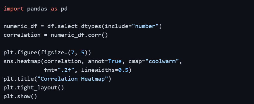
Cells with strong red or blue colors indicate strong positive or negative relationships between variables — those are the patterns worth investigating further.
Step 5: Add a Trend Line
A trend line (also called a regression line) draws a straight line through scatter plot data that best represents the overall direction of the relationship. It filters out the noise and shows the underlying pattern clearly.
Seaborn's regplot() adds this trend line automatically with a single parameter.
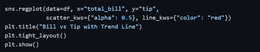
The shaded area around the line represents the confidence interval, a narrower band means the trend is more consistent and reliable across the data.
Step 6: Group and Compare with Aggregation
Sometimes patterns only become visible when data is grouped and summarized. Aggregating data by category and comparing the results across groups is a powerful pattern-detection technique.
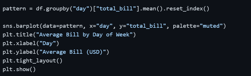
If Saturday and Sunday consistently show higher average bills than weekdays, that is a clear behavioral pattern in the data, one that directly informs business decisions like staffing and inventory.
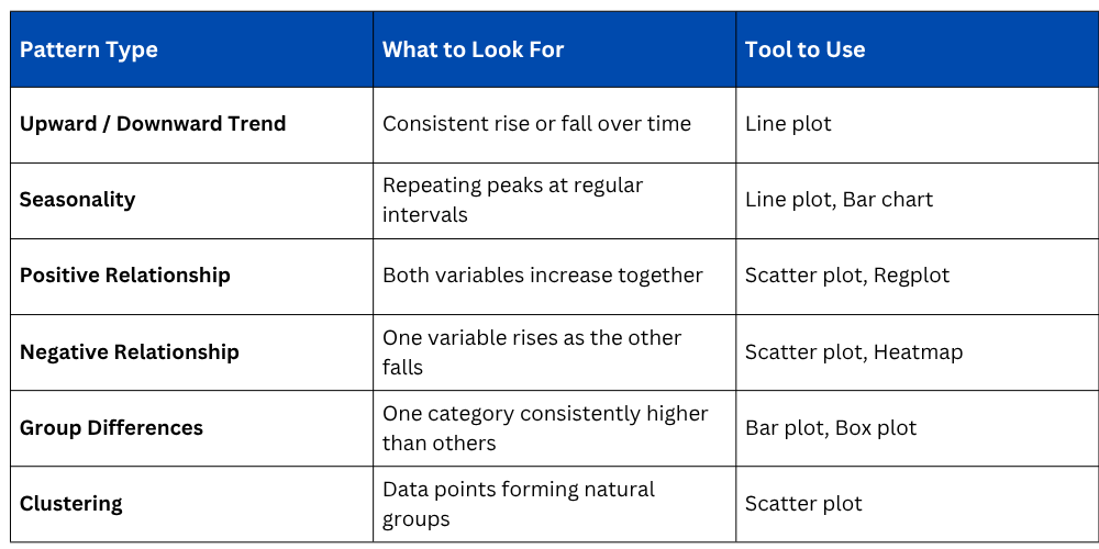
Common Patterns to Look For in Data
When exploring any dataset, these are the key patterns worth actively searching for during EDA.

Class Sessions
Sales Campaign

We have a sales campaign on our promoted courses and products. You can purchase 1 products at a discounted price up to 15% discount.