Once you are comfortable with the basics of Matplotlib, the next step is learning how to create the most commonly used chart types in data analysis.
Line charts, bar charts, pie charts, and histograms cover the majority of real-world visualization needs from tracking trends over time to understanding how data is distributed.
Each chart type is designed to answer a specific kind of question about your data, and knowing when and how to use each one is a core skill for any data analyst.
Line Chart
A line chart is used to visualize data points connected by a continuous line, making it ideal for showing trends over time or ordered sequences. It is one of the most frequently used charts in business, finance, and scientific analysis.
.png)
Key Parameters:
1. color — sets the line color.
2. linewidth — controls the thickness of the line.
3. marker — adds a symbol at each data point (e.g., "o" for circle, "s" for square).
4. linestyle — changes the line style ("--" for dashed, "-." for dash-dot).
When to use it: Whenever your X-axis represents time or a continuous ordered sequence, monthly revenue, daily temperature, yearly growth.
Bar Chart
A bar chart uses rectangular bars to compare values across different categories. The height of each bar represents the value for that category, making comparisons straightforward and intuitive.
.png)
Key Parameters
1. color — fill color of the bars.
2. edgecolor — border color around each bar.
3. width — controls the width of each bar.
Horizontal Bar Chart: When category names are long, a horizontal bar chart (barh) is easier to read.

When to use it: Comparing discrete categories — sales by region, scores by student, revenue by product.
Pie Chart
A pie chart displays parts of a whole, showing how each category contributes to the total as a percentage. It works best when you have a small number of categories (ideally 5 or fewer) and want to highlight proportional differences.
.png)
Key Parameters:
1. autopct — displays percentage values inside each slice (e.g., "%1.1f%%").
2. explode — slightly separates a slice from the rest for emphasis.
3. startangle — rotates the starting position of the first slice.
When to use it: Showing proportional composition — market share, budget allocation, survey responses. Avoid pie charts when categories have very similar values, as small differences are hard to read visually.
Histogram
A histogram shows the frequency distribution of a single numerical variable by dividing the data into intervals called bins and counting how many values fall into each bin. Unlike a bar chart, which compares categories, a histogram reveals the shape and spread of your data.
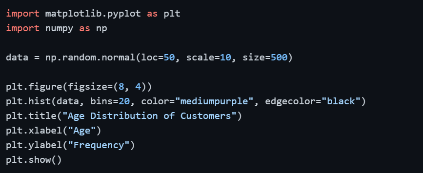
Key Parameters:
1. bins — number of intervals to divide the data into; more bins = more detail, fewer bins = broader overview
2. color — fill color of the bars
3. edgecolor — border color between bars
When to use it: Understanding data distribution- age of customers, exam score distribution, income range. Always experiment with the number of bins to find the most informative view of your data.

Class Sessions
Sales Campaign

We have a sales campaign on our promoted courses and products. You can purchase 1 products at a discounted price up to 15% discount.