A chart without a title leaves the audience guessing its purpose, and axes without labels make the data impossible to interpret correctly.
Matplotlib provides a rich set of customization options that allow you to control every visual element of your plot, from font sizes and colors to grid lines and overall style themes.
Good customization does not mean making charts look decorative, it means making them communicate more clearly and honestly.
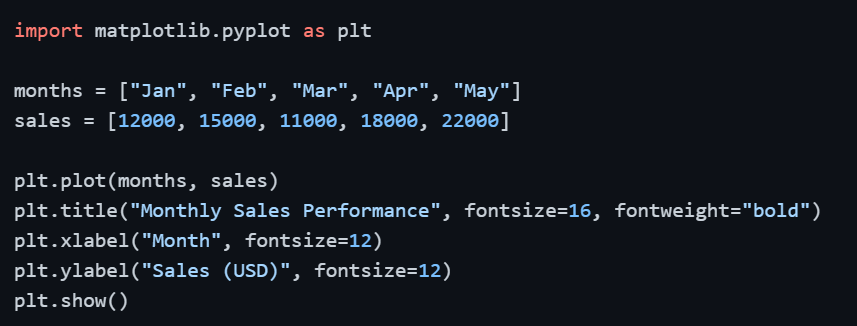
Adding Titles and Axis Labels
Titles and axis labels are the minimum requirement for any chart that will be shared or presented. They tell the audience exactly what the chart represents and what each axis measures.
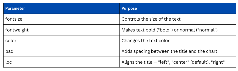
Key Parameters for Titles and Labels
Customizing Tick Marks
Tick marks are the value markers along the X and Y axes. By default, Matplotlib places them automatically, but you can override them to show exactly the values you want, especially useful when working with categorical data or custom ranges.

The rotation parameter is particularly useful when X-axis labels are long and overlap each other, rotating them at 45 degrees keeps the chart clean and readable.
Adding a Legend
When a chart contains more than one data series, a legend is essential. It maps each line, bar, or color to its corresponding category so the audience can distinguish between them.
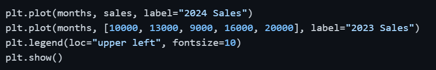
Legend Location Options: "upper left", "upper right", "lower left", "lower right", "best" — using "best" lets Matplotlib automatically find the least cluttered position.
Adding Grid Lines
Grid lines help the audience trace values across the chart more accurately, especially for charts with many data points. They should be subtle — noticeable enough to be useful, but not dominant enough to distract from the data.

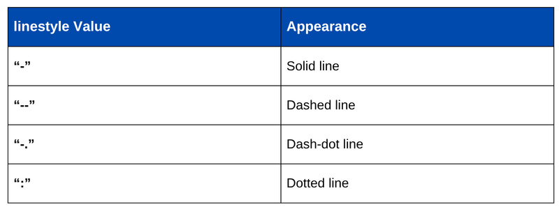
1. linestyle — style of grid lines ("--" dashed, ":" dotted, "-" solid)
2. alpha — transparency level (0 = fully transparent, 1 = fully opaque)
Controlling Figure Size and Resolution
The default Matplotlib figure size is often too small for presentations or reports. You can set a custom size using figsize and control export resolution using dpi.

1. figsize=(width, height) — dimensions in inches
2. dpi — dots per inch; higher values produce sharper images (150–300 for print quality)
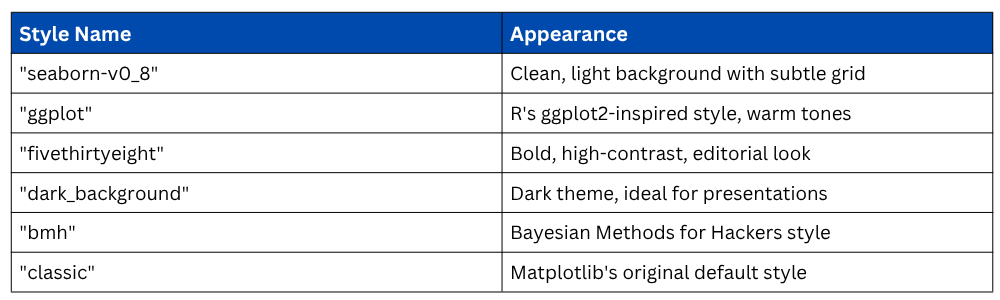
Applying Built-in Style Themes
Matplotlib includes a collection of pre-built style themes that instantly change the visual appearance of all charts-background color, font style, grid visibility, and color palette without requiring manual adjustments.

Popular Built-in Styles
To see all available styles on your system:

Customizing Colors and Line Styles
Color and line style choices directly affect how easy a chart is to read, especially when multiple series are present. Matplotlib accepts colors as named strings, hex codes, or RGB tuples.
plt.plot(months, sales, color="#2E86AB", linewidth=2, linestyle="--", marker="o")
Line Style Options
Adding Annotations
Annotations allow you to highlight specific data points directly on the chart, useful for drawing attention to a peak, a drop, or a significant event.

1. xy — the point being annotated (data coordinates).
2. xytext — where the annotation text is placed.
3. arrowprops — defines the arrow style connecting text to the point.
Complete Customized Plot Example
Bringing all customization elements together into a single, polished chart:
import matplotlib.pyplot as plt
plt.style.use("seaborn-v0_8")
months = ["Jan", "Feb", "Mar", "Apr", "May"]
sales_2024 = [12000, 15000, 11000, 18000, 22000]
sales_2023 = [10000, 13000, 9000, 16000, 20000]
plt.figure(figsize=(9, 5))
plt.plot(months, sales_2024, color="#2E86AB", linewidth=2,
marker="o", label="2024 Sales")
plt.plot(months, sales_2023, color="#E84855", linewidth=2,
marker="s", linestyle="--", label="2023 Sales")
plt.title("Year-on-Year Sales Comparison", fontsize=16, fontweight="bold")
plt.xlabel("Month", fontsize=12)
plt.ylabel("Sales (USD)", fontsize=12)
plt.legend(loc="upper left", fontsize=10)
plt.grid(True, linestyle="--", alpha=0.6)
plt.tight_layout()
plt.show()
plt.tight_layout() automatically adjusts spacing between chart elements so nothing overlaps or gets clipped — always a good habit to include.

Class Sessions
Sales Campaign

We have a sales campaign on our promoted courses and products. You can purchase 1 products at a discounted price up to 15% discount.