Advanced data visualization plays a central role in modern data science by transforming massive, complex datasets into coherent visual narratives that reveal hidden structure, relationships, and anomalies.
As datasets grow in scale, granularity, and dimensionality, traditional charts such as static bar graphs or line plots become insufficient for deep analysis.
Advanced visualization techniques integrate interactive systems, multi-layer displays, high-dimensional projections, and real-time rendering, enabling analysts and decision-makers to explore data at a granular and dynamic level.
These methods not only enhance interpretability but also encourage exploratory thinking, allowing users to drill down into patterns that would otherwise remain obscured in raw tables or plain summaries.
New-age visualization tools leverage GPU acceleration, browser-based rendering engines, and cloud-backed dashboards, making it possible to visualize millions of records instantly.
Platforms like Plotly, Power BI, Tableau, and D3.js support interactive filtering, geographic mapping, time-based animations, and integration with machine learning models.
These systems allow users to build immersive dashboards where insights unfold based on user interactions rather than static snapshots.
Advanced visualization also intersects with storytelling, where insights are structured as guided narratives helping both technical and non-technical audiences make informed decisions.
Key Advanced Visualization Methods & Tools
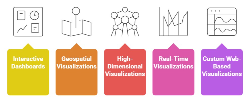 1. Interactive Dashboards (Tableau, Power BI, Plotly Dash)
Interactive dashboards support dynamic exploration of data, allowing users to apply filters, slice dimensions, and drill into granular details without altering the underlying dataset.
These dashboards respond to user actions instantly, enabling deeper analysis than static reports.
Tools like Tableau and Power BI offer built-in connectors for cloud databases, enabling visualization of live data streams.
For example, a retail analytics dashboard may update hourly to display real-time sales performance, customer patterns, and inventory shortages.
Dash frameworks such as Plotly Dash allow developers to build custom, browser-based applications that integrate directly with Python or R models.
These interfaces help data scientists expose complex models to business teams through intuitive visuals.
A fraud detection dashboard might highlight suspicious transactions on an interactive map with risk scores that update as new data flows in.
2. Geospatial Visualizations (Kepler.gl, GeoPandas, QGIS)
Geospatial visualization enables analysts to map data patterns across locations, uncovering spatial relationships and environmental context that traditional charts cannot capture.
Tools like Kepler.gl provide GPU-accelerated rendering, making it possible to visualize millions of geospatial points, heatmaps, and movement trajectories.
For example, a logistics company can use Kepler.gl to examine fleet movement patterns, delays, and route efficiency at scale.
GeoPandas allows spatial operations like buffering, clustering, and coordinate transformations, which are essential for geographic analysis.
QGIS supports layering demographic, environmental, and infrastructural data for urban planning.
These tools reveal spatial disparities, regional performance variations, and geographic dependencies critical for decision-making.
3. High-Dimensional Visualizations (t-SNE, UMAP, Parallel Coordinates)
High-dimensional visualization methods reduce complex feature spaces into compact, interpretable layouts.
t-SNE and UMAP map hundreds of features into 2D plots to expose clusters, overlaps, and anomalies.
For example, a company analyzing customer behavior can use UMAP projections to identify distinct buying segments that share hidden characteristics.
Parallel coordinate plots help visualize multi-dimensional trends by representing each feature as a vertical axis.
When plotted together, patterns emerge through line groupings, revealing correlations or divergent behaviors.
Such plots are valuable in domains like bioinformatics or financial risk assessment, where numerous attributes influence outcomes.
4. Real-Time/Streaming Visualizations (Grafana, Kibana, Apache Superset)
Streaming visualizations handle continuous data flow, enabling instant insight from sensors, web traffic, financial trades, and IoT devices.
Grafana and Kibana integrate seamlessly with time-series databases like ElasticSearch or InfluxDB to visualize changes as they occur.
These tools display real-time metrics, anomaly spikes, and performance fluctuations, making them essential for monitoring applications.
For instance, a cybersecurity team may track access logs and threat alerts through live dashboards that instantly update when suspicious activity occurs.
5. Custom Web-Based Visualizations (D3.js, Three.js, ECharts)
D3.js offers unparalleled flexibility for creating bespoke interactive visualizations using web standards like SVG, canvas, and HTML.
Analysts can craft unique visual structures such as chord diagrams, radial trees, or animated transitions that illustrate relationships elegantly.
Three.js adds 3D rendering, enabling immersive visual analytics where trends can be explored in depth, such as 3D scatterplots for scientific research.
ECharts supports smooth animations, drill-down interactions, and themed dashboards suitable for large-scale enterprise deployments.
Challenges & Limitations of Advanced Data Visualization
Advanced data visualization enables deeper insights by presenting complex datasets in interactive and intuitive formats.
However, it comes with challenges related to performance, interpretation, compatibility, and security that must be addressed for effective implementation.
1. Performance Bottlenecks with Large-Scale Data
High-volume datasets containing millions of rows can overwhelm browsers or visualization engines.
Rendering lags, memory overflows, and freezing dashboards are common issues.
Even GPU-accelerated tools struggle when visualizing excessively dense geospatial or high-dimensional data.
This requires sampling, aggregation, or tiling strategies to avoid visualization overload.
2. Misinterpretation Due to Overly Complex Visuals
Advanced charts like radial graphs, 3D plots, chord diagrams, and parallel coordinates can confuse non-technical users.
If not designed carefully, they obscure insights instead of revealing them.
Complex visuals may cause cognitive overload, leading stakeholders to misinterpret trends, correlations, or outliers.
3. Tool Compatibility and Integration Issues
Different visualization platforms often require specific data formats, APIs, or backend configurations.
Migrating dashboards across ecosystems (e.g., Tableau → Power BI) is difficult. Embedding ML outputs into visualization layers may require custom scripting, web frameworks, or containerization.
4. Limited Support for Real-Time Rendering
Visualizing streaming data demands optimized pipelines, and many tools cannot handle rapid refresh rates.
Real-time dashboards can lose accuracy if update frequencies exceed infrastructure limits or network bandwidth.
5. Inconsistency in Cross-Device Experience
Advanced visualizations with intricate interactions may not render well on mobile or low-power devices.
Layout distortion, control misalignment, or poor zoom performance can reduce usability.
6. Data Privacy and Security Concerns
Dashboards often expose sensitive data. Improper access control can lead to privacy violations.
Geospatial visualizations, if not anonymized, can leak personal movement patterns or business-critical locations.
Best Practices for Implementing Advanced Visualizations
Implementing advanced visualizations effectively requires a balance between clarity, performance, and usability.
Following best practices ensures insights are communicated accurately while maintaining interactivity, security, and accessibility across platforms.
1. Start with Clear Analytical Objectives
Define what insights the visualization should reveal. Avoid unnecessary complexity choose the chart type that directly answers the analytical question. This ensures clarity and prevents misinterpretation.
2. Use Data Reduction Techniques Wisely
Apply binning, sampling, aggregation, or clustering to handle large datasets. Tools like Datashader can render billions of points efficiently. This maintains performance while preserving essential patterns.
3. Optimize for Interactivity and User Navigation
Use filtering, brushing, drill-downs, and responsive panels to guide users through the data. Interactive designs prevent overwhelming viewers with excessive details upfront.
4. Apply Visual Hierarchy and Design Principles
Consistent color scales, proper spacing, minimal clutter, and intuitive legends improve readability. Highlight key regions or events using contrast and progressive disclosure.
5. Perform Cross-Platform Testing
Ensure dashboards perform well on desktops, tablets, and mobile devices. Optimize layouts for smaller screens and ensure animations or transitions degrade gracefully when hardware is limited.
6. Secure Visualization Pipelines
Implement role-based access, access logging, and anonymization when necessary. For cloud dashboards, ensure traffic is encrypted and user permissions are granularly controlled.
7. Document and Explain the Visual Logic
Include tooltips, annotations, or embedded explanations. This helps non-experts understand why certain patterns appear and how metrics are computed.

Class Sessions
Sales Campaign

We have a sales campaign on our promoted courses and products. You can purchase 1 products at a discounted price up to 15% discount.