Applying conditional formatting and visual level filters in Power BI enhances report readability, usability, and insight delivery by visually emphasizing important data points and controlling what information appears in each visual.
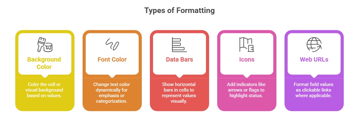
Conditional formatting uses color, icons, or data bars within visuals to highlight data trends, outliers, or performance against targets, thereby making patterns and exceptions instantly recognizable.
Visual level filters empower report authors to customize each visual’s data scope independently, enabling focused analysis by restricting data shown without affecting other report elements.
Together, these features elevate user engagement and support precise, data-driven decision-making.
Conditional formatting can be applied to tables, matrices, cards, and other visuals based on numeric values, text, or even other field values, using rules or formula-driven logic.
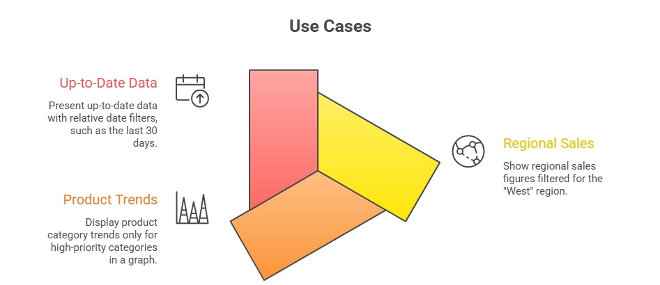
Visual-level filters are set within the filter pane, allowing the user to filter data by specific criteria such as ranges, categories, or relative dates for each visual individually.
Unlike page or report level filters, visual filters affect only their associated charts or tables, providing granular control over data presentation and helping tailor each visual to serve focused analytical purposes.
Applying Conditional Formatting
Conditional formatting enhances data interpretation by visually emphasizing important values and patterns. The key techniques listed below explain how to apply formatting effectively and consistently.
Implementation Steps
1. Select the visual (table, matrix, or card).
2. In the Visualizations pane, click the down-arrow next to the value field.
3. Choose Conditional formatting and select the type.
4. Define rules based on data ranges, other fields, or DAX expressions.
5. Preview and adjust for clarity and effectiveness.
Best Practices
1. Use colors consistently and sparingly to avoid confusion.
2. Align formatting with business rules or benchmarks.
3. Avoid excessive formatting that overwhelms or misleads users.
4. Use accessibility-friendly colors to accommodate color vision deficiencies.
Visual Level Filters
The purpose is to limit the data displayed in a single visual independently of other visuals or pages.
Configuring Filters
1. Drag relevant fields to the Filters on this visual pane.
2. Set criteria, such as selecting categorical values, ranges, or relative periods.
3. Combine multiple filters for precise data restriction.
Benefits
1. Customizes each visual’s focus without impacting report-wide filters.
2. Supports multi-faceted reports where different visuals highlight different slices of data.
3. Enhances storytelling by controlling data scope visually per chart or table.

Class Sessions
Sales Campaign

We have a sales campaign on our promoted courses and products. You can purchase 1 products at a discounted price up to 15% discount.