Hierarchies and drill-down techniques are essential features in Power BI that enhance data visualization and user interactivity by organizing data into multi-level structures.
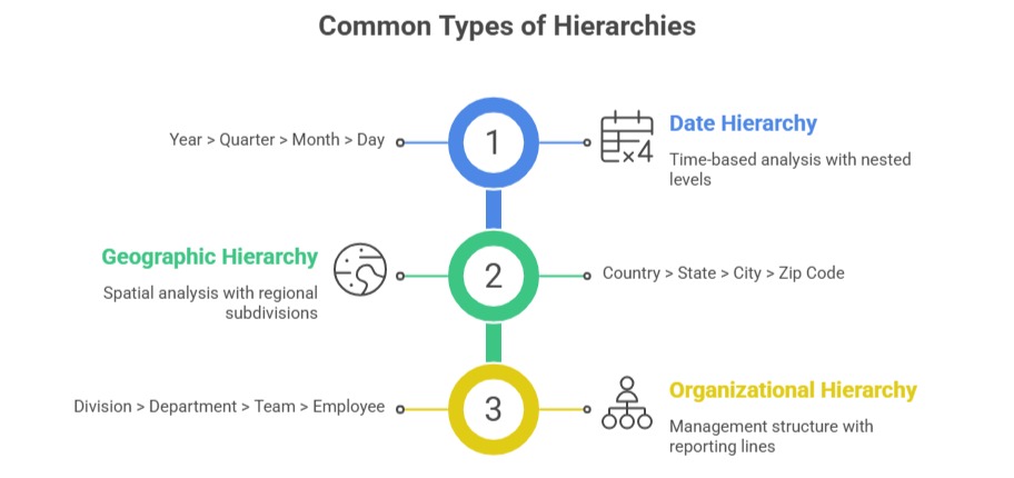
Hierarchies group related fields in a logical order, such as Year > Quarter > Month > Day, allowing users to explore aggregated data at different levels of granularity.
Drill-down functionality lets users navigate through these hierarchy levels seamlessly within reports, providing both high-level overviews and detailed insights.
These capabilities improve data exploration, making reports more intuitive and enabling users to uncover hidden patterns and trends effectively.
Hierarchies simplify complex datasets by providing structured pathways for analysis. They are created by grouping columns that represent related categorical levels or time periods.
Drill-down and drill-up operations empower users to click through visual elements—like charts or tables—to dive deeper into underlying data or roll back to broader views.
Combining hierarchical navigation with interactive filtering and slicers results in dynamic, layered storytelling that supports deeper decision-making.
Understanding Hierarchies in Power BI
A hierarchy is a set of ordered columns that represent levels of data aggregation or categorization.
Creating Hierarchies: In Power BI Desktop, fields can be dragged on top of each other in the Fields pane to create a hierarchy.
Hierarchies improve report usability by enabling intuitive, multi-level data browsing in visuals.
Drill-Down and Drill-Up Operations
Drill-Down: Users move from aggregated data to more detailed data. For example, moving from yearly sales totals down to quarterly and then monthly figures.
Drill-Up: Users return from detailed levels to higher-level summaries.
Drill Mode in Visuals: Activating drill mode enables clickable navigation on charts like bar graphs, matrices, and pie charts.
Cross-Visual Drill: Through interactions, drill-downs in one visual can affect other connected visuals for coordinated insights.
Benefits of Using Hierarchies and Drill-Down
Hierarchies and drill-down features enhance how users interact with and interpret data. Listed below are the key benefits that support intuitive and insightful analysis.
1. Simplifies Complex Data: Users can digest information step-by-step rather than overwhelming detail.
2. Improves Insight Discovery: Facilitates uncovering trends and anomalies at various levels
3. Enhances User Experience: Interactive exploration empowers self-service analytics.
4. Supports Layered Storytelling: Combines overview and deep dive analysis in the same report.
Best Practices for Hierarchies and Drill-Down
1. Design hierarchies reflecting natural business or data relationships.
2. Limit hierarchy levels to maintain user simplicity and performance.
3. Use descriptive naming for levels to clarify report navigation.
4. Combine with informative tooltips and slicers for enhanced interactivity.
5. Test drill paths to ensure smooth transitions and relevant detail exposure.

Class Sessions
Sales Campaign

We have a sales campaign on our promoted courses and products. You can purchase 1 products at a discounted price up to 15% discount.