USD ($)
$
United States Dollar
Euro Member Countries
India Rupee

Choosing the Right Visuals (Charts, KPIs, Maps, Tables)

Lesson 27/44 | Study Time: 20 Min

Choosing the right visuals in Power BI is fundamental to effectively communicating data insights and enabling users to make data-driven decisions. The choice of chart or visual depends on the type of data, the story you want to tell, and the audience’s needs.

Selecting an appropriate visual enhances comprehension by emphasizing key messages, revealing patterns, and making complex data accessible at a glance.

Whether using charts, KPIs, maps, or tables, the goal is to present data clearly, accurately, and intuitively while minimizing unnecessary clutter or confusion.

Charts are excellent for comparing values, showing trends, or illustrating distributions. KPIs provide quick snapshots of important metrics and performance indicators.

Maps visualize geographical data to reveal regional patterns or location-specific insights. Tables offer detailed, granular views for exact values and categorical breakdowns.

Selecting the Right Visuals

The right visuals help stakeholders quickly grasp performance and patterns. The list below outlines the key visual categories used in professional dashboards and reports.


1. Charts


Bar and Column Charts: Ideal for comparing categories or showing changes over time.

Line Charts: Best for trend analysis across continuous time periods.

Pie and Donut Charts: Show proportions of parts to a whole but best used with limited categories.

Scatter and Bubble Charts: Reveal relationships and distributions among numerical data points.

Waterfall Charts: Illustrate cumulative effects such as profit and loss movements.


2. Key Performance Indicators (KPIs)


Highlight critical metrics and targets with simplicity and clarity.

Use visual cues such as colors, arrows, or gauges to indicate status against goals.

Place KPIs prominently for executive dashboards.


3. Maps


Display regional data like sales by geography, customer locations, or logistics.

Use filled maps for aggregated regional representation and bubble maps for point locations.

Consider scalability and interactivity (zoom, tooltips) for exploration.


4. Tables and Matrices


Provide detailed, structured views for data exploration and validation.

Support conditional formatting to highlight relevant variances.

Use sparingly to avoid overwhelming users with too much information.

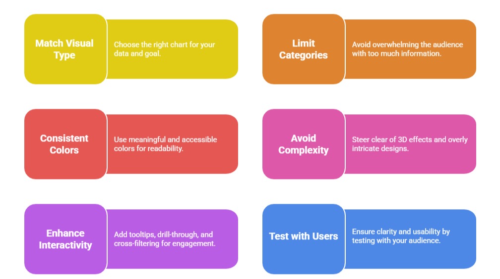
Best Practices for Choosing Visuals


1. Match visual type to data and analytical objective (e.g., compare, trend, distribution).

2. Limit the number of categories or data points to avoid clutter.

3. Use consistent, accessible colors that have meaning and maintain readability.

4. Avoid 3D effects or overly complex visuals that can distort perception.

5. Incorporate tooltips, drill-through, and cross-filtering to enhance interactivity.

6. Test visuals with representative users to ensure clarity and usability.

Ryan Cole

Ryan Cole

Product Designer
Profile

Class Sessions

1- Overview of Business Intelligence Concepts 2- Power BI Ecosystem and Components 3- Understanding Power BI Desktop, Service, and Mobile App 4- Data-Driven Decision Making Fundamentals 5- Connecting to Data Sources (SQL, Excel, Cloud, APIs) 6- Data Import vs Direct Query 7- Power Query Editor Basics and Advanced Transformations 8- Data Cleaning, Shaping, and Formatting 9- Creating Query Parameters and Templates 10- Principles of Data Modeling in Power BI 11- Star Schema and Snowflake Schema Concepts 12- Creating and Managing Relationships Between Tables 13- Calculated Columns vs Measures 14- Role of Lookup and Fact Tables in BI 15- DAX Fundamentals and Syntax 16- Calculated Columns and Measures in Depth 17- Aggregation and Filter Functions 18- Time Intelligence Calculations (YTD, MTD, QTD, etc.) 19- Context in DAX: Row Context and Filter Context 20- Using Variables and Advanced Calculation Techniques 21- Dynamic Calculations and What-If Analysis 22- Hierarchies and Drill-Down Techniques 23- Working with Parent-Child and Many-to-Many Relationships 24- Optimizing DAX for Performance 25- Principles of Effective Data Visualization 26- Creating Interactive Reports and Dashboards 27- Choosing the Right Visuals (Charts, KPIs, Maps, Tables) 28- Using Bookmarks, Tooltips, and Drillthroughs 29- Applying Conditional Formatting and Visual Level Filters 30- Publishing Reports to Power BI Service 31- Workspaces and Apps in Power BI 32- Sharing and Collaborating Securely with Row-Level Security (RLS) 33- Scheduled Refresh and Data Gateway Configuration 34- Usage Metrics and Report Usage Monitoring 35- Real-Time Data Streaming and Dashboards 36- Integration with Azure Synapse and Cognitive Services 37- AI Features in Power BI: Insights, Q&A, and Anomaly Detection 38- Using Power Automate with Power BI for Workflow Automation 39- Implementing Predictive Analytics and Forecasting 40- Best Practices for Data Model Optimization 41- Query Reduction and Load Optimization Techniques 42- Troubleshooting Common Power BI Issues 43- Monitoring Performance with Performance Analyzer 44- Governance and Compliance Considerations in Power BI

Sales Campaign

Sales Campaign

We have a sales campaign on our promoted courses and products. You can purchase 1 products at a discounted price up to 15% discount.