In the world of data science, charts and dashboards act as the bridge between raw data and meaningful interpretation.
While charts help break down complex concepts into understandable visuals, dashboards combine multiple visual elements to present a consolidated view of performance, patterns, or trends.
These tools allow analysts, decision-makers, and stakeholders to quickly grasp the status of a dataset, compare metrics, identify issues, and take corrective actions without needing deep technical knowledge.
Effective dashboards and charts are designed not only to present information but to guide users toward specific insights, such as anomalies, correlations, performance gaps, or forecasting patterns that matter for business, research, or machine learning operations.
In practice, creating insightful dashboards requires a blend of visual design, analytical thinking, and understanding of the audience’s goals.
When built correctly, they become essential components of monitoring model performance, examining data quality, and supporting strategic decision-making.
Creating Charts for Insights
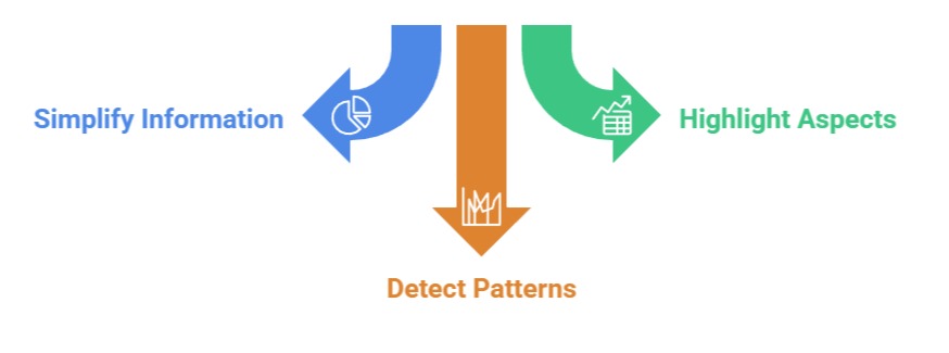
1. Charts help simplify multidimensional information for clear interpretation
Charts convert numerical and categorical information into visual patterns that the human brain can quickly decode.
This transformation allows data scientists to uncover relationships, trends, and growth behaviors that might be difficult to recognize from tables alone.
For example, a trend line can instantly reveal whether a model’s accuracy is improving across iterations, while a histogram can expose skewed feature distributions.
By simplifying complex datasets, charts act as stepping stones for deeper analysis, enabling users to move from general patterns to detailed investigation.
This approach supports exploratory stages, model selection, and communication with non-technical audiences.
2. Different chart types highlight different aspects of a dataset
Every chart—from scatter plots and bar charts to boxplots and area graphs—has a unique purpose.
Scatter plots reveal associations between variables, bar charts compare group metrics, and boxplots show the spread and concentration of values.
The ability to choose the appropriate chart ensures that insights are not only accurate but clearly conveyed.
For example, when evaluating customer segmentation results, a scatter plot with clustering boundaries can display how well groups are separated.
Selecting the right visual tool provides clarity, reduces misinterpretation, and enhances decision-making precision.
3. Charts facilitate quick pattern detection during model development
During machine learning workflows, charts allow data scientists to track model behavior over iterations.
Visuals such as learning curves, confusion matrices, ROC curves, or feature importance charts illustrate how algorithms respond to hyperparameter changes or data transformations.
For instance, monitoring the drop in validation loss through a line plot can signal whether a model is overfitting.
These visual cues guide model tuning, reduce experimentation time, and improve accuracy by making the development process more transparent.
Building Dashboards for Insights
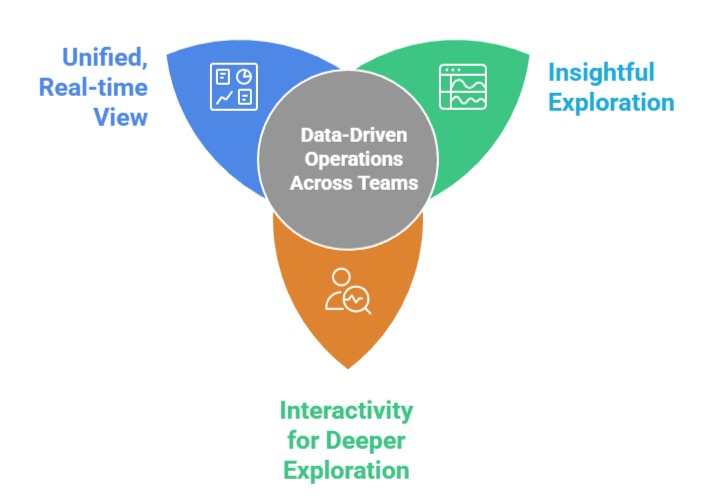
1. Dashboards provide a unified, real-time view of multiple insights
A dashboard integrates several charts, tables, and metrics into one interactive interface, enabling users to observe various performance indicators at a glance.
This consolidated setup is essential for monitoring machine learning models in production, tracking business KPIs, or examining data pipelines.
For example, a model monitoring dashboard may include accuracy trends, data drift indicators, prediction distributions, and latency metrics.
By centralizing information, dashboards reduce the need for manual report generation and support quick decision-making.
2. Dashboards enable interactivity for deeper exploration
Interactive dashboards allow users to filter data, drill down into specific segments, adjust time ranges, or switch between visualization types.
This flexibility empowers users to uncover insights that static charts may not reveal.
For instance, filtering customer churn data by region or age group can expose patterns that influence retention strategies.
Interactivity increases engagement, encourages exploration, and supports personalized analysis depending on the viewer’s needs.
3. Dashboards support data-driven operations across teams
Modern organizations rely on dashboards to align stakeholders—analysts, managers, engineers, and leadership—toward shared understanding.
Dashboards ensure everyone sees the same metrics, reducing ambiguity and miscommunication.
When machine learning models are deployed, dashboards play a crucial role in tracking performance, identifying data drift, detecting anomalies, and maintaining accountability.
They become operational tools that guide strategies, automate alerts, and reinforce consistent, data-backed actions.

Class Sessions
Sales Campaign

We have a sales campaign on our promoted courses and products. You can purchase 1 products at a discounted price up to 15% discount.