Visualization tools play a foundational role in data science because they allow practitioners to convert complex numerical information into interpretable graphical forms.
These tools are essential for exploring data patterns, validating assumptions, examining relationships among variables, and communicating results to technical and non-technical audiences.
In modern data workflows, visualization tools are used not only during Exploratory Data Analysis (EDA) but also throughout model development—such as for evaluating model performance, understanding feature behavior, and identifying anomalies.
Matplotlib and Seaborn are the two most widely used Python libraries for visualization, offering flexibility, customization, and statistical plotting capabilities.
While Matplotlib provides low-level control suitable for precise design, Seaborn builds on it with high-level functions for elegant, statistically oriented visuals.
Matplotlib
Matplotlib is one of the oldest and most fundamental plotting libraries in Python, designed to give users total control over every aspect of a figure. It acts as the foundation upon which many other visualization libraries—like Seaborn—are built.
Because of its low-level nature, Matplotlib can produce anything from basic line graphs to highly customized scientific illustrations.
It follows a structure similar to MATLAB’s plotting system, making it familiar for users from engineering or numerical computing backgrounds.
In data science, Matplotlib is widely used for Exploratory Data Analysis (EDA), model performance visualization, time-series monitoring, and publication-quality chart generation.
Its strength lies in flexibility and precision, enabling fine adjustments to fonts, grids, scales, subplot arrangements, and visual themes.
Example: Simple Line Plot with Matplotlib
import matplotlib.pyplot as plt


x = [1, 2, 3, 4]

y = [10, 20, 15, 30]


plt.plot(x, y)

plt.title("Sample Line Plot")

plt.xlabel("X-axis")

plt.ylabel("Y-axis")

plt.show()
Importance of Matpolib
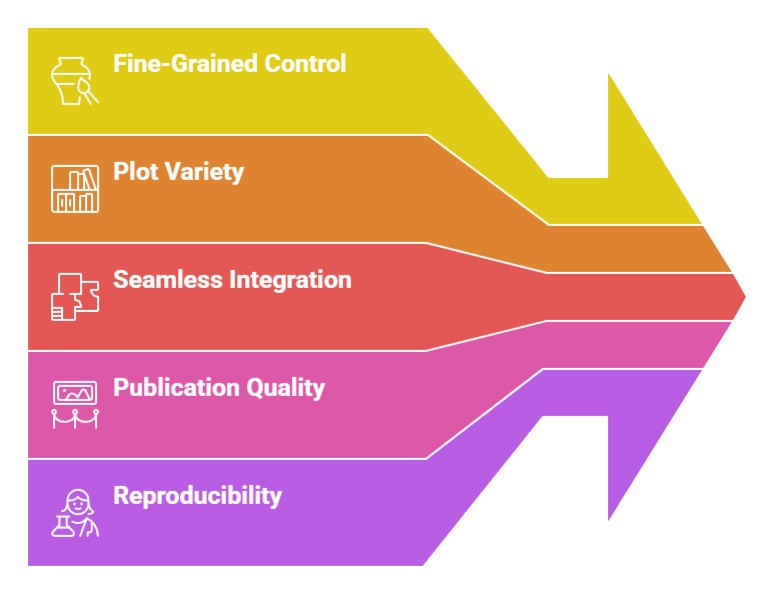
1. Offers fine-grained control over every graphical component
Matplotlib allows developers to manipulate virtually every element of a plot—axes, colors, scales, ticks, grids, labels, and more.
This granular control is useful when creating highly specific visual structures required in research publications or customized dashboards.
For Example, reshaping axis boundaries or adjusting tick frequency can help highlight subtle trends within time series.
This degree of customization makes Matplotlib ideal for advanced machine learning diagnostics, where precision matters.
Its low-level design ensures nothing is locked behind default settings, making it a versatile tool across varied analytical contexts.
2. Supports a wide variety of plot types required in data science
The library provides support for histograms, scatter plots, line graphs, pie charts, area charts, and 3D visualizations.
This collection enables users to illustrate distributions, compare variables, inspect correlations, and monitor model performance.
For instance, plotting ROC curves or loss functions during model training becomes straightforward with Matplotlib.
The ability to combine multiple plot types in subplots also simplifies multi-step analysis, making it a complete solution for exploratory and explanatory visual tasks.
3. Integrates seamlessly with numerical libraries like NumPy and Pandas
Since Matplotlib accepts NumPy arrays and Pandas series/dataframes directly, the plotting workflow becomes smooth and intuitive.
Data extracted from machine learning pipelines can be visualized without additional restructuring.
This interoperability ensures that intermediate results, such as transformed features or predicted outputs, can be checked instantly.
The ease of pairing Matplotlib with array-based computations helps data scientists validate preprocessing steps, detect inconsistencies, and verify transformations before model fitting.
4. Enables creation of publication-quality figures
Matplotlib supports vector formats such as SVG, PDF, and EPS, which are essential for academic papers, professional presentations, and technical documents.
By adjusting DPI, line weight, font size, and color schemes, users can enhance clarity and readability for different viewing environments.
Many scientific communities rely on Matplotlib-generated visuals because they maintain crisp details even when scaled.
This makes the library indispensable for those who work in research-driven or documentation-heavy settings.
5. Encourages reproducibility through script-based plotting
Unlike GUI-based tools, Matplotlib plots are created using code, making every figure reproducible.
This ensures transparency during collaborative data science projects or machine learning experiments.
If a plot needs revision, modifying a few lines of code can consistently regenerate it. Version-controlled plotting scripts also make it easy to track updates, enabling reliable auditing and reproducibility—critical in regulated environments such as finance, medicine, and climate analysis.
Seaborn
Seaborn is a high-level visualization library built on top of Matplotlib, offering a cleaner interface and visually appealing default styles.
It focuses heavily on statistical graphics and is optimized for working directly with Pandas DataFrames.
Seaborn excels when you want to understand distributions, compare categories, or explore relationships among multiple variables.
Its built-in color palettes, intuitive syntax, and statistically meaningful visualizations make EDA much faster and more expressive.
Seaborn automatically handles many tedious layout decisions—such as spacing, legends, or tick formatting—allowing analysts to focus on insights rather than plot configuration.
For data science workflows, Seaborn is especially valuable when visualizing correlations, regression trends, or grouped datasets.
Importance of Seaborn
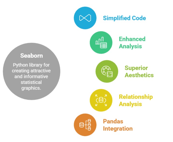
1. Simplifies complex visualizations with minimal code
Seaborn’s high-level API allows users to produce visually appealing graphs with fewer lines of code compared to Matplotlib.
For instance, a single function such as sns.pairplot() can create multiple relational plots capturing variable interactions.
This efficiency is especially valuable during EDA, where rapid visualization cycles help analysts uncover hidden relationships.
By reducing the need for extensive customization, Seaborn allows practitioners to focus on insight extraction rather than graphical setup.
2. Built-in statistical visualizations enhance analysis quality
Seaborn integrates statistical operations directly into its visual functions, such as estimating distributions, smoothing lines, or calculating confidence intervals.
Plots like violin charts, boxplots, KDE curves, and regression lines become effortless to produce. For machine learning workflows, these visualizations help interpret target distributions, detect skewness, analyze variance, or explore linear relationships.
This built-in statistical depth provides stronger evidence for preprocessing decisions and modeling strategies.
3. Superior aesthetics with cohesive color palettes
Seaborn includes thematic color palettes, gradient maps, and context presets that create polished visuals by default.
It automatically handles spacing, scaling, and layout adjustments, reducing the manual effort typically required in Matplotlib.
The resulting charts appear more refined, making them well-suited for presentations, dashboards, and client reports.
These curated aesthetics ensure visual consistency across multiple charts, providing a cohesive storytelling experience.
4. Excellent for analyzing relationships between multiple variables
Seaborn is particularly powerful for multivariate analysis—heatmaps, pair plots, joint plots, and FacetGrid-based visualizations reveal patterns between multiple features.
This capability is crucial when preparing data for machine learning models, especially when identifying interactions, redundancies, or correlated pairs.
For example, a heatmap of correlation coefficients can instantly highlight features that may cause multicollinearity. Such multi-dimensional exploration speeds up model-building decisions and reduces guesswork.
5. Strong integration with Pandas for dataset-level visualization
Seaborn works smoothly with Pandas DataFrames, allowing users to refer to columns by name without restructuring arrays.
This simplifies workflows where datasets contain numerous attributes. Dataset-aware plotting functions make it easy to slice, filter, or group data before visualization.
As a result, Seaborn supports fast iteration during data cleaning and feature engineering, making it an essential tool for machine learning practitioners handling large or messy datasets.