Fundamentals of data visualization focus on converting raw numeric or categorical information into visual formats that reveal structure, relationships, and meaning more effectively than textual or tabular representations.
Whether dealing with machine learning datasets, business intelligence dashboards, or exploratory research, visualizing data allows analysts to recognize hidden trends, detect abnormalities, and articulate insights to both technical and non-technical audiences.
It bridges the gap between complex analytical computations and human cognitive perception.
In modern data workflows, visualization is not merely an aesthetic add-on—it operates as an analytical instrument.
Effective visual design clarifies uncertainties, exposes distributional properties, and provides immediate context for decision-making.
Techniques ranging from simple bar charts to sophisticated interactive visual systems jointly support pattern discovery, hypothesis formation, and model interpretation.
With the growing scale of datasets, the ability to craft clear, truthful, and scalable visuals has become an essential skill for data practitioners.
Visualization fundamentals also emphasize principles such as selecting the right chart type, using color with purpose, structuring data narratives, avoiding distortion, and ensuring accessibility.
Importance of Data Visualisation
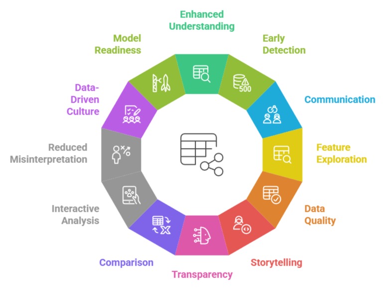
1. Enhances human understanding of complex patterns
Visual representation reduces cognitive load by translating multidimensional data into intuitive structures.
Humans detect shapes, slopes, and clusters faster than they interpret raw numbers, making visual tools indispensable for quick comprehension.
Charts such as scatterplots, heatmaps, and line graphs reveal trends that may remain hidden in spreadsheets.
This improved comprehension accelerates hypothesis testing, especially during exploratory work.
In machine learning contexts, visual tools help assess relationships between features and targets. Ultimately, this enhanced clarity leads to more informed decisions and deeper analytical insights.
2. Supports early detection of anomalies and irregularities
Unexpected spikes, gaps, or deviating points become instantly visible when data is visualized.
This early anomaly detection is critical in domains like fraud analytics, healthcare monitoring, and quality control.
Visualizing distributions uncovers outliers that may disrupt model training or bias results.
Tools like boxplots, density curves, and time-series charts highlight unusual variations clearly.
Analysts can quickly investigate whether these abnormalities stem from data quality issues or genuine events.
This proactive identification ultimately improves data reliability before feeding it into downstream machine learning pipelines.
3. Strengthens communication across diverse stakeholder groups
Visualization transforms technical findings into narratives that non-experts can grasp without statistical background.
Executives, clients, and cross-functional teams rely on clear visuals to interpret outcomes and justify actions.
Well-structured charts help present insights efficiently during presentations or reports.
Communicating uncertainty, differences, or performance comparisons becomes more straightforward with visual cues.
This shared understanding fosters collaboration and speeds up decision-making cycles.
In machine learning projects where model results require explainability, clear visuals significantly improve transparency and trust.
4. Facilitates better feature exploration and model design
During preprocessing or model development, visualization allows practitioners to inspect distributions, correlations, variances, and class imbalances.
These insights guide feature engineering decisions such as transformations, binning, or selection.
Correlation heatmaps illuminate redundant or highly related features, preventing multicollinearity in models.
Pair plots help assess non-linear relationships that conventional statistics may overlook.
This visual exploration shapes the overall model design, helping data scientists pick architectures or algorithms that suit the underlying data patterns.
5. Encourages data quality assessment and verification
Visualization helps validate whether collected data aligns with expected ranges, formats, or trends.
Missing values, duplicates, or inconsistent entries become easy to identify when plotted.
Visual checks prevent incorrect assumptions that could compromise downstream models.
Histograms, bar charts, and distribution plots reveal sampling biases or data acquisition errors.
Such visual assessments act as a safeguard, ensuring the dataset is representative and complete before analysis or training.
6. Enables storytelling and narrative structure in insights delivery
Visualization acts as a narrative tool by guiding the viewer through a logical journey from context to conclusion.
A well-designed sequence of visuals highlights how evidence builds toward a final insight. Using contrast, hierarchy, and positioning, analysts can emphasize critical findings without overwhelming the audience.
This narrative-driven approach ensures that insights are understood as part of a broader storyline rather than isolated observations. In business settings, data storytelling often drives organizational action.
7. Promotes transparency and interpretability in machine learning workflows
Visualization plays a critical role in interpreting models, especially when dealing with complex algorithms like ensemble methods or neural networks.
Tools such as feature importance plots, partial dependence graphs, and SHAP visualizations allow practitioners to see how individual features influence predictions.
This visual interpretability improves accountability, especially in sensitive domains such as healthcare or finance.
It helps identify whether a model behaves unexpectedly for certain segments of the data.
Transparent visual explanations also help address ethical concerns related to fairness, bias, and algorithmic opacity. By offering a clear window into model behavior, visualization increases trust among stakeholders.
8. Helps compare multiple datasets, models, or scenarios effectively
Comparative decision-making becomes far more efficient when differences are visualized rather than described verbally or numerically.
Side-by-side bar charts, overlapping density curves, and multi-line trend charts help contrast scenarios and reveal subtle distinctions.
This comparison is essential when evaluating several machine learning models or assessing how data changes across regions, user groups, or time windows.
Visual comparisons also prevent misinterpretation that may arise from raw statistical tables.
The clarity brought by these comparative charts guides better model selection and business strategy alignment.
Overall, visualization simplifies multi-scenario evaluation that would otherwise be cognitively heavy.
9. Supports interactive analysis for deeper insight discovery
Modern visualization tools such as Plotly, Tableau, Power BI, and Altair enable interactive filtering, zooming, and dynamic querying.
Interactivity allows users to analyze different layers of the dataset seamlessly without generating dozens of static charts.
It empowers analysts to drill down into individual data points, segments, or time intervals.
This flexibility is particularly valuable for large, high-dimensional data where conventional plots may miss finer details.
Interactive visuals also support experimentation, helping users rapidly test assumptions or explore anomalies.
Ultimately, interactivity enriches the analytical process and exposes insights that static visuals cannot provide.
10. Reduces misinterpretation of statistical summaries
Statistical measures like means, medians, and standard deviations often hide underlying irregularities such as skewness or multimodality. Visualization reveals these concealed characteristics, ensuring analysts do not rely on misleading summaries.
For example, two datasets with identical averages may exhibit dramatically different distributions when graphed.
Visual tools such as violin plots, boxplots, and scatter matrices highlight hidden variations.
This reduces the risk of building flawed models or drawing incorrect conclusions based solely on aggregated metrics.
Visualizing data from multiple angles guards against oversimplification and ensures robust reasoning.
11. Encourages data-driven culture in organizations
Clear, consistent visual communication fosters a culture where decisions rely on verifiable evidence rather than intuition or assumption.
Dashboards, trend charts, and performance monitors help teams track progress and align with organizational goals.
When insights are visually accessible, teams become more proactive in raising questions and exploring opportunities.
Visualization democratizes data access so that even non-technical teams can interpret key indicators.
This cultural shift drives continuous improvement, innovation, and accountability. Organizations with strong visual literacy often adapt faster and execute more informed strategies.
12. Enables early assessment of model readiness and deployment feasibility
Before deploying a machine learning model, visualization helps assess whether the underlying data behaves predictably and consistently across different subsets.
Visual inspection of training/validation splits, class distributions, and temporal segments ensures that the model does not face unexpected patterns during deployment.
Monitoring drift through visual time-series plots helps detect when the model’s assumptions start breaking.
Visualization also reveals whether certain features contribute unstable or erratic signals.
These early checks prevent costly deployment failures and improve long-term model performance.