Numbers alone rarely tell the full story. Visualizing data helps you spot patterns, understand distributions, identify outliers, and communicate findings clearly — all critical steps in AI and data science.
Matplotlib is Python's most widely used data visualization library. It gives you full control over charts and plots, from simple line graphs to complex multi-panel figures.
Installing and Importing Matplotlib
Matplotlib comes pre-installed with Anaconda. To install manually:

Import the plotting module using the standard alias:

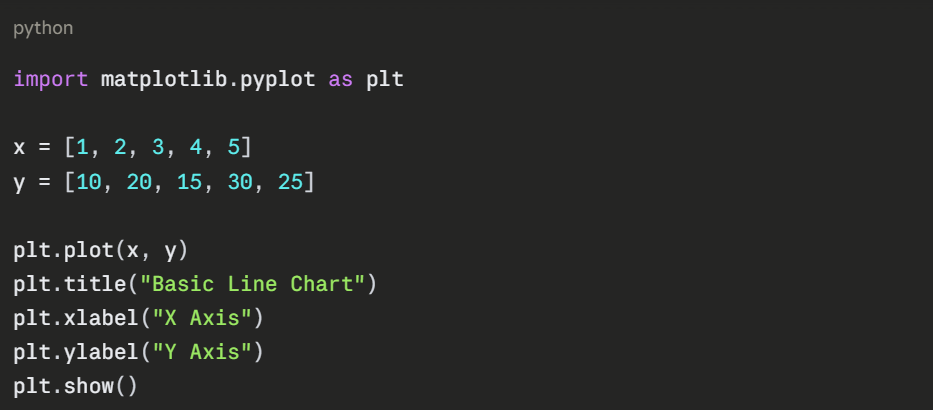
The Basic Plot Structure
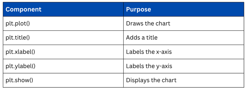
Every Matplotlib chart follows the same simple pattern — create data, plot it, add labels, and display it.
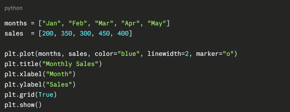
Line Chart
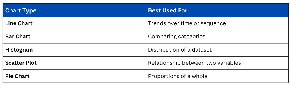
A line chart is used to show trends over time or a continuous sequence of values. It is one of the most common charts in data analysis.
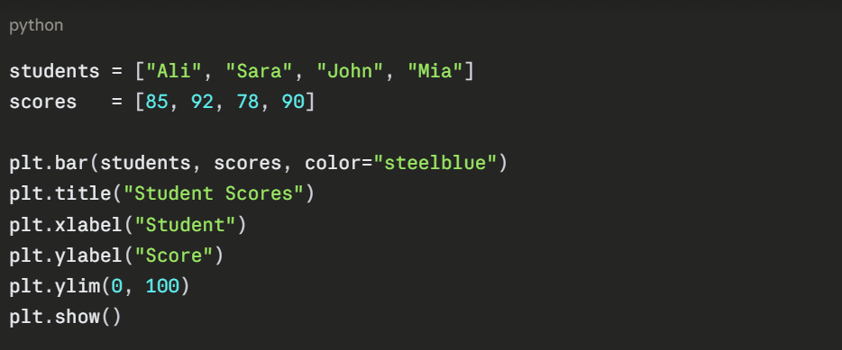
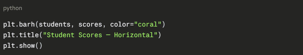
A bar chart compares values across categories. It is ideal for comparing groups, scores, or frequencies side by side.
Histogram
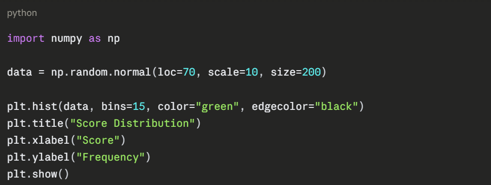
A histogram shows the distribution of a dataset, how frequently values fall within certain ranges. It is widely used in AI to understand data spread and detect outliers.
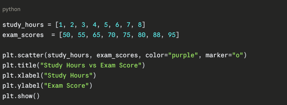
A scatter plot displays the relationship between two numerical variables. It is heavily used in AI to visualize correlations and spot clusters in data.
Pie Chart
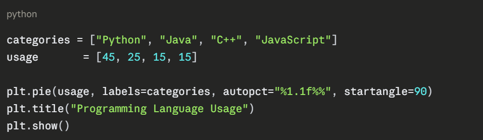
A pie chart shows proportions of a whole. Use it when you want to display percentage breakdowns of categories.
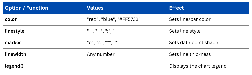
Matplotlib gives you full control over the appearance of your plots.
Multiple Plots — Subplots
Instead of just displaying, you can save charts as image files for reports or presentations.
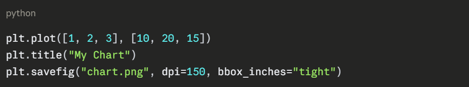
1. dpi controls image quality (150–300 for print quality).
2. bbox_inches="tight" removes excess whitespace around the chart.
Chart Types — When to Use Which

Class Sessions
Sales Campaign

We have a sales campaign on our promoted courses and products. You can purchase 1 products at a discounted price up to 15% discount.