Dashboards are powerful tools that synthesize complex business data into concise, interactive visual displays tailored for non-technical business users. Effective dashboard design transforms raw data into actionable insights, enabling users to monitor key metrics, detect trends, and support informed decision-making.
Designing dashboards for business users requires a blend of best practices focusing on clarity, relevance, usability, and visual storytelling to meet diverse user needs across roles and contexts.
Understand Your Audience
A successful dashboard begins by clearly defining the target users, their roles, responsibilities, and information needs.
1. User personas: Identify whether the dashboard is for executives, managers, analysts, or operational staff; each group needs different levels of detail.
2. Decision context: Understand what decisions the dashboard supports and tailor data displays accordingly.
3. Usage environment: Consider devices and scenarios in which dashboards will be accessed (e.g., desktop, mobile, presentations).
Define Clear Goals and KPIs
Dashboards should have focused objectives aligned with business goals to avoid overload and ambiguity.
1. Select key performance indicators (KPIs) that measure success and indicate performance trends.
2. Include supporting metrics that provide context but avoid cluttering the interface.
3. Link KPIs directly to actionable outcomes to drive user engagement and impact.
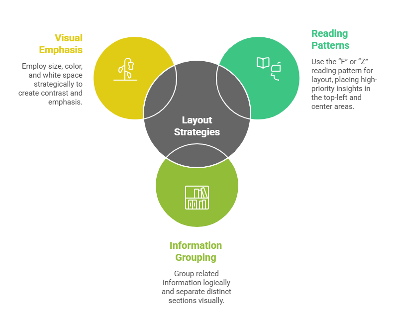
Layout and Visual Hierarchy
The arrangement of content should guide users’ attention to the most critical information first.
Choose Appropriate Visualizations
Data visuals communicate insights more efficiently than raw numbers, but must align with the data type and analysis task.
1. Use bar and column charts for comparisons, line charts for trends, and pie charts sparingly for simple parts-of-a-whole.
2. Tables can be used for detailed data, but avoid dense, overwhelming grids.
3. Incorporate interactivity like filters, drill-downs, and hover-over tooltips to enable deeper exploration without cluttering.
Ensure Simplicity and Clarity
Minimalism in design reinforces clarity and reduces cognitive load.
1. Avoid unnecessary decorative graphics or excessive colors that distract from key insights.
2. Use consistent color palettes and visual elements aligned with branding and accessibility standards.
3. Limit the number of metrics or visuals displayed to maintain focus; offer detailed views elsewhere through links or navigation.
Interactivity and Usability
Interactive features empower users to tailor views and uncover personalized insights.
1. Provide filtering options to slice data by time periods, regions, products, or other relevant dimensions.
2. Enable drill-down paths for examining granular details while preserving high-level summaries.
3. Include clear legends, labels, and explanatory texts to support understanding.
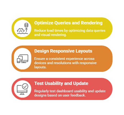
Performance and Responsiveness
Dashboards must perform efficiently to ensure timely access to information.
Continuous Improvement and Maintenance
Dashboards are dynamic tools that should evolve with changing business needs.
1. Monitor dashboard usage metrics to identify which components add value or need refinement.
2. Collect user feedback systematically to address challenges and enhance functionality.
3. Update data sources, KPIs, and visualizations periodically to reflect current priorities.