Data visualization is the practice of translating complex data sets into graphical or pictorial formats that communicate insights clearly and effectively. Well-designed visualizations enhance understanding, reveal patterns, and support decision-making by making data accessible to diverse audiences.
However, effective data visualization requires more than just plotting charts—it demands adherence to core principles that guide clarity, accuracy, and usability.
Clarity and Simplicity
Clear and straightforward visuals allow viewers to grasp insights quickly without confusion. Complexity should be reduced by focusing on key messages, removing unnecessary clutter, and organizing elements logically.
1. Use simple charts suited to the data type, like bar charts for comparisons and line charts for trends.
2. Avoid overloading visuals with too many colors, labels, or data points.
3. Maintain clean layouts with adequate spacing and alignment to guide the eye naturally.
Choosing the Right Visuals
Selecting appropriate chart types is essential to accurately represent the underlying data relationships and answer specific questions.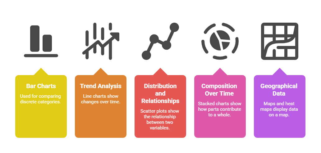
The chosen visualization should match both the data characteristics and the intended story.
Use of Color and Contrast
Color attracts attention and conveys meaning, but should be used thoughtfully to enhance—not overshadow—the data.
1. Use purposeful color palettes with high contrast for readability.
2. Avoid color schemes that are hard to distinguish, such as red-green, especially to support viewers with color vision deficiencies.
3. Use color to highlight key data points, trends, or categories consistently.
Visual Hierarchy and Emphasis
Organize visual elements to prioritize important data and facilitate quick interpretation.
1. Use size, boldness, or positioning to indicate significance.
2. Group related data and separate distinct elements for clarity.
3. Include clear titles, legends, and labels to provide context and guide interpretation.
Storytelling and Context
Good visualization tells a story that leads viewers through the data logically, highlighting insights and supporting meaningful conclusions.
1. Frame the visualization with an informative title or question.
2. Use annotations, reference lines, and captions to emphasize critical points or trends.
3. Present data in a natural order (chronological, ordinal, or logical sequences) to aid comprehension.
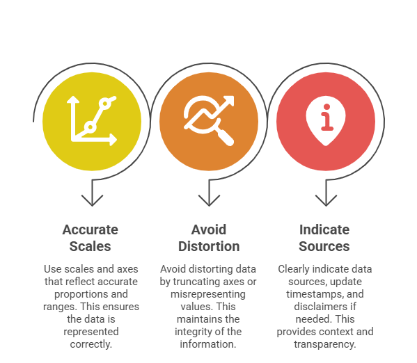
Accuracy and Ethics
Data visualizations must represent data truthfully to maintain credibility and avoid misleading interpretation.
Accessibility and Inclusivity
Ensure visualizations are interpretable by the broadest audience, including people with disabilities.
1. Provide sufficient contrast and font size for readability.
2. Avoid exclusive reliance on color; supplement with shapes, patterns, or text labels.
3. Enable keyboard navigation and screen reader compatibility in interactive visuals.
Interactivity and Exploration
Interactive visualizations empower users to explore data dynamically, uncovering hidden patterns and personalizing insights.
1. Incorporate features such as tooltips, zooming, filtering, and drill-down.
2. Maintain simplicity by avoiding overwhelming users with too many options.

Class Sessions
Sales Campaign

We have a sales campaign on our promoted courses and products. You can purchase 1 products at a discounted price up to 15% discount.