Visualization tools are essential in healthcare data science because they help transform complex medical datasets into clear, interpretable insights that clinicians, administrators, and policymakers can act upon.
Healthcare data is often large, multidimensional, and heterogeneous, involving patient records, diagnostic images, lab results, genomic data, billing codes, time-series vitals, and wearable sensor outputs.
Without proper visualization, identifying patterns, anomalies, and relationships becomes extremely challenging.
Modern visualization tools not only offer interactive dashboards but also allow real-time monitoring of patient trends, comparison of population health indicators, and visual exploration of disease progression.
These tools support predictive modeling by displaying feature behaviors, correlations, and outcome distributions in ways that enhance interpretability.
From basic charting libraries like Matplotlib, Seaborn, and ggplot2, to advanced interactive platforms like Tableau, Power BI, Plotly Dash, and Looker Studio, visualization frameworks empower healthcare professionals to drill down into large datasets efficiently.
Healthcare-specific tools such as EHR dashboards, clinical decision support visualization modules, imaging viewers, and HL7-FHIR visualization plugins make the process even more meaningful.
The growing adoption of AI in hospitals also requires visualization tools capable of presenting explainable model outputs, risk scores, Shapley values, and treatment recommendations in clinician-friendly formats.
Effective visualization ultimately improves communication, reduces diagnostic uncertainty, enhances monitoring, and increases the accuracy of clinical decision-making.
Role and Importance of Data Visualization in Healthcare Analytics
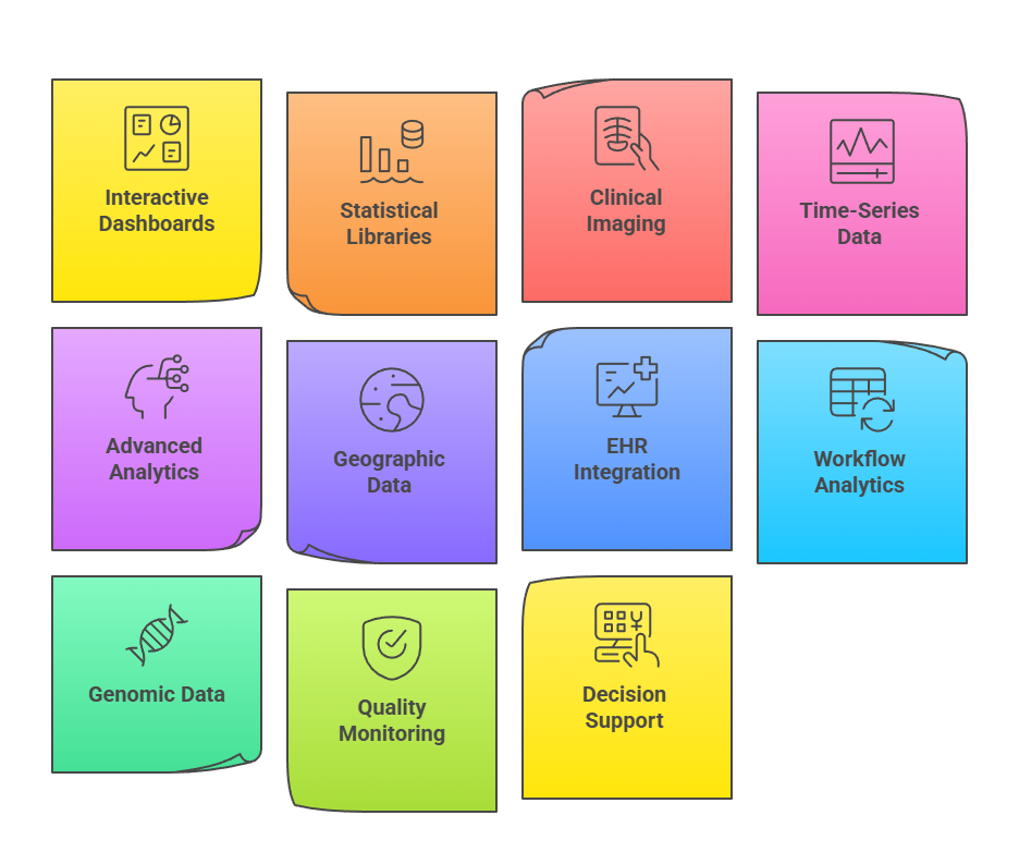 1. Interactive Dashboards and Reporting Tools
Interactive tools such as Tableau, Power BI, and Looker Studio allow users to create real-time dashboards that help visualize patient metrics, operational performance, and population-level health indicators.
These dashboards support filtering, drill-down analysis, and automated refreshing of EHR or claims data.
Healthcare administrators use them to monitor bed occupancy, resource allocation, and treatment outcomes. Clinicians benefit by exploring trends in vital signs, lab values, and risk scores without needing to write code.
These tools also enhance decision-making through color-coded alerts, predictive indicators, and benchmarking visuals. Their accessibility makes them essential for hospitals implementing data-driven workflows.
2. Statistical and Exploratory Visualization Libraries
Libraries such as Matplotlib, Seaborn, Plotly, and ggplot2 help analysts visualize complex patterns in structured health data. They enable the creation of histograms, heatmaps, correlation matrices, and time-series plots to understand clinical distributions and trends.
Analysts use them to study relationships among lab results, medication dosages, and disease indicators, supporting hypothesis formation and model development. Plotly offers interactive 3D charts and temporal animations, which are useful for visualizing disease progression or ICU vitals.
These libraries are highly customizable, making it easy to adapt charts for research publications, presentations, and regulatory reports. Their flexibility helps uncover subtle patterns not easily identifiable in raw datasets.
3. Clinical Imaging Visualization Tools
Healthcare demands specialized tools to visualize medical images such as X-rays, MRIs, CT scans, and ultrasound data. Tools like DICOM viewers, ITK-SNAP, 3D Slicer, and radiology PACS systems enable detailed exploration of anatomy, tissue structures, and abnormalities.
These visualization platforms support segmentation, annotation, and 3D reconstruction, which are crucial for diagnosis and surgical planning.
AI-assisted visualization overlays pathology predictions on images, helping clinicians interpret results faster and with greater accuracy. Integration with EHR systems allows radiologists to compare historical images with current scans, creating a more comprehensive clinical picture. These tools are increasingly enhanced by machine learning to support automated feature extraction and pathology identification.
4. Time-Series and Wearable Device Visualization Tools
Health data often includes continuous streams from wearables, bedside monitors, and sensor networks.
Tools like Plotly Dash, Grafana, and EHR vitals dashboards help visualise trends in heart rate, blood pressure, oxygen saturation, glucose levels, and activity patterns.
Time-series charts reveal fluctuations, seasonal patterns, and anomalies that may indicate deteriorating health or treatment responses.
Clinicians can monitor patient states in real time, enabling early intervention during emergencies. These visualizations also support remote patient monitoring programs and telemedicine initiatives. Combining time-series visuals with predictive alerts strengthens clinical decision-making and reduces hospitalization risks.
5. Advanced Analytics Visualization (AI Explainability Tools)
With the integration of machine learning in healthcare, tools that visualize model behavior have become essential.
Libraries such as SHAP, LIME, and Eli5 provide interpretable visualizations showing how different features influence predictions like disease risk, treatment response, or readmission probability.
These visual explanations help clinicians trust AI models by making predictions transparent. Heatmaps, contribution plots, and feature importance charts make it easier to validate model fairness, detect bias, and ensure compliance with healthcare regulations.
Such tools bridge the gap between sophisticated algorithms and practical clinical decision-making. They also assist regulatory bodies in evaluating the safety and reliability of AI-driven solutions.
6. Geographic & Epidemiological Visualization Tools
Geospatial tools like ArcGIS, QGIS, and epidemiology dashboards allow healthcare professionals to visualize disease spread across regions, identify hotspots, and monitor public health indicators in real time.
These tools help map infection clusters, track vaccination rates, and analyze environmental influences on disease patterns.
During outbreaks or pandemics, such visualizations support policymakers in planning containment strategies, allocating medical supplies, and predicting future case trajectories.
Heat maps, choropleth maps, and spatial overlays make complex epidemiological data more intuitive.
Integration with population data helps public health teams identify vulnerable communities. These tools are essential for proactive surveillance and timely public health interventions.
7. EHR-Integrated Visualization Modules
Many modern Electronic Health Record systems include built-in visualization panels that present patient vitals, medications, lab results, and historical trends in simplified visual formats.
These modules allow clinicians to quickly interpret fluctuations in patient condition and correlate symptoms with ongoing treatments.
Trend lines, color-coded alerts, and timeline views help providers make faster, more informed decisions. Visualizing patient history on a single interface reduces cognitive load and minimizes errors during clinical assessments.
These tools also support interdisciplinary collaboration through shared views accessible to physicians, nurses, and specialists. As EHR systems evolve, visualization modules increasingly incorporate AI-driven alerts for early risk detection.
8. Visualization Tools for Operational & Hospital Workflow Analytics
Operational dashboards use visualization tools like Tableau, Power BI, or custom hospital analytics platforms to monitor emergency department wait times, ICU occupancy, staff allocation, and supply chain performance.
These tools help administrators optimize workflow efficiency, predict resource shortages, and minimize patient delays.
Visual tracking of equipment usage, appointment volumes, and scheduling patterns supports better planning and reduces hospital bottlenecks. Sankey diagrams, flow maps, and process timelines reveal inefficiencies that are otherwise hard to detect.
By presenting operational data visually, hospitals can reduce costs while improving the quality of patient services. Operational visualization is now central to data-driven hospital management.
9. Visualization Tools for Genomic & Omics Data
Genomic visualisation platforms such as IGV (Integrative Genomics Viewer), UCSC Genome Browser, and BioJupies allow researchers to explore gene sequences, mutations, expression levels, and variants.
These tools translate complex molecular data into interactive maps, alignment views, and pattern graphs that support precision medicine initiatives.
Visualizing genomic information helps identify biomarkers, understand disease mechanisms, and develop personalised treatments. Heat-maps and volcano plots assist in comparing gene expression across different patient cohorts.
These platforms integrate seamlessly with bioinformatics pipelines, making genomic analysis more efficient. As genomic data grows, effective visualization is critical to clinical interpretation and scientific discovery.
10. Visualization Tools for Quality & Safety Monitoring
Healthcare organizations use specialized dashboards to visualize safety events, medication errors, readmission rates, and compliance with clinical guidelines.
Tools such as QlikView, hospital quality scorecards, and regulatory reporting systems transform raw quality metrics into actionable insights. These visualizations help identify risks, monitor clinical performance, and ensure adherence to patient safety protocols.
Trend charts and comparative analytics enable leaders to benchmark performance against national standards.
Visualization simplifies accreditation processes by creating clear reports for audits and inspections. Ultimately, these tools contribute to safer care environments and improved patient outcomes.
11. Visualization for Real-Time Clinical Decision Support
Clinical Decision Support Systems (CDSS) increasingly rely on visualization components to present risk alerts, diagnostic recommendations, and predictive scores in a user-friendly manner.
These visual tools highlight high-risk patients, abnormal values, and suggested interventions through intuitive charts and alert panels.
Clear visualization reduces alert fatigue by emphasizing only critical signals. These systems integrate with real-time patient monitoring devices to display dynamic dashboards of vital signs and deterioration warnings.
CDSS visualizations enhance physician confidence and assist in prioritizing urgent cases. As AI-enhanced CDSS grows, visualization will remain central for ensuring trust and interpretability.