Creating marketing dashboards and reports is a central part of descriptive analytics, enabling marketers to transform raw data into actionable business insights.
As campaigns run across platforms like Google Ads, Facebook, Instagram, email tools, CRM systems, and websites, marketers need a consolidated view to understand what is working and where improvements are needed.
Dashboards present real-time or periodic performance metrics visually, while reports provide structured insights, explanations, and strategic recommendations.
Together, they support efficient monitoring, faster decisions, and improved communication across marketing, sales, and leadership teams.
Modern dashboards go far beyond static charts. They use interactive visual elements, filters, drill-downs, KPI scorecards, trendlines, heatmaps, and attribution views to provide deeper insight.
Marketing dashboards also integrate with APIs and connectors to pull live data from multiple sources, reducing manual work and ensuring accuracy.
With increasing pressure for data-driven marketing, creating professional dashboards and reports has become an essential skill for marketers, analysts, and decision-makers.
A well-designed dashboard highlights core KPIs clearly—such as conversions, CTR, ROAS, CAC, traffic sources, and engagement metrics—without overwhelming the viewer.
The goal is to make insights accessible, eliminate ambiguity, and support informed decisions that lead to better campaign performance.
Designing and Managing Marketing Dashboards and Reports
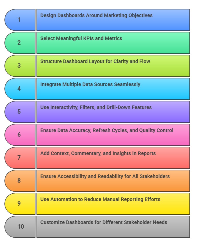
1. Designing Dashboards Around Marketing Objectives
Effective dashboards start with clear marketing goals such as lead generation, brand awareness, conversions, or retention.
By aligning KPI selection with objectives, marketers ensure the dashboard remains focused and relevant.
Each chart should help answer a specific business question—for example, “Which channels drive the most qualified leads?” or “Is our ROAS improving?” Objective-aligned dashboards reduce noise by excluding unnecessary metrics.
This helps stakeholders concentrate on what truly impacts performance.
When built around goals, dashboards become strategic tools rather than data dumps.
Clear alignment improves accountability and supports better decision-making.
2. Selecting Meaningful KPIs and Metrics
Choosing the right KPIs is at the heart of dashboard effectiveness.
Depending on the marketing function, KPIs may include CPC, CAC, CTR, revenue, LTV, ROAS, impressions, conversions, bounce rate, AOV, or churn.
Each metric must be clearly defined to avoid confusion and misinterpretation among stakeholders.
Dashboards should highlight primary KPIs using scorecards or bold visuals, making them instantly accessible.
Secondary metrics support deeper analysis but should not overpower key indicators.
Well-chosen KPIs help teams focus on performance drivers and identify problems early. This leads to faster optimization and smarter strategy adjustments.
3. Structuring Dashboard Layout for Clarity and Flow
A professional dashboard follows a clear visual hierarchy: key KPIs at the top, trends in the middle, and detailed breakdowns below.
This structure guides the viewer’s eye logically, ensuring information is absorbed quickly.
Grouping charts by topic—such as traffic, conversions, spend, or audience—improves organization.
White space, alignment, and consistent design principles enhance readability.
A clean layout reduces cognitive load and allows users to interpret insights with minimal effort.
Poor layout design can distort understanding and lower the dashboard’s impact. A structured flow ensures visual storytelling remains smooth and intuitive.
4. Integrating Multiple Data Sources Seamlessly
Marketing dashboards often combine data from diverse platforms: Google Analytics, Facebook Ads, CRM systems, email tools, and e-commerce platforms.
Integration allows marketers to see the complete customer journey in one place.
Using connectors, APIs, or data warehouses ensures data flows reliably and updated metrics appear automatically.
Unified dashboards eliminate the need for manual reporting and reduce the risk of errors.
Combined views help uncover patterns that are invisible when analyzing platforms separately.
For example, CRM revenue attribution can be correlated with ad engagement data. Seamless integration increases accuracy and insight depth.
5. Using Interactivity, Filters, and Drill-Down Features
Modern dashboards are interactive, allowing users to explore data rather than simply view it.
Filters for date ranges, channels, locations, or audience segments help users personalize insights.
Drill-down functions allow viewers to move from high-level KPIs to detailed datasets—for example, from overall conversions → campaign → ad group → keyword.
Interactive elements empower non-technical teams to analyze data independently.
These features reduce the need for multiple reports and enable faster decision-making.
Interactivity turns dashboards into dynamic analytical tools rather than static visual summaries.
6. Ensuring Data Accuracy, Refresh Cycles, and Quality Control
Dashboards must maintain high accuracy, as decisions depend heavily on the data presented.
Establishing automated data refresh cycles ensures updated information is always available.
Data validation, error checks, and anomaly detection help maintain integrity. Incorrect numbers—even small discrepancies—can erode trust and lead to poor decisions.
Creating documentation around definitions, formulas, and sources enhances transparency.
Quality control is crucial when multiple teams access dashboards.
Maintaining accuracy builds confidence and ensures stakeholders rely on analytics for strategic planning.
7. Adding Context, Commentary, and Insights in Reports
While dashboards show numbers, reports explain what those numbers mean.
Reports should provide interpretation, insights, reasons for changes, and action recommendations.
Commentary helps stakeholders understand not just what happened, but why it happened.
Annotations, notes, and highlight points guide viewers toward key performance drivers.
By linking visual patterns to business outcomes, reports turn data into meaningful stories.
Including insights ensures leadership can make decisions confidently without needing analytical expertise. Reports complement dashboards by adding clarity and strategic depth.
8. Ensuring Accessibility and Readability for All Stakeholders
Dashboards should be designed for marketers, managers, executives, and non-technical teams alike.
Using simple language, standardized metrics, and intuitive visuals ensures everyone can understand insights quickly.
Mobile-friendly and responsive dashboards allow stakeholders to access information anywhere.
Color-blind accessible palettes and readable fonts improve usability.
Dashboards must be tested with different stakeholders to ensure clarity. Accessibility ensures analytics is democratized and available to everyone involved in marketing decisions.
9. Using Automation to Reduce Manual Reporting Efforts
Automation is a crucial benefit of modern marketing dashboards, helping teams save time and eliminate repetitive reporting tasks.
Tools like Power BI, Tableau, Looker Studio, and automated spreadsheet scripts can fetch data directly from ad platforms, CRM systems, and analytics tools.
Automated pipelines ensure that dashboards update daily or even hourly without human intervention.
This minimizes manual errors, improves data consistency, and allows marketers to focus more on interpretation rather than data preparation.
Automation is especially valuable for agencies managing multiple clients or businesses running frequent campaigns.
By automating reporting, marketing teams can deliver insights faster and operate more efficiently.
10. Customizing Dashboards for Different Stakeholder Needs
Different teams require different levels of detail, and dashboards must be tailored accordingly.
For example, executives prefer high-level KPIs and trend summaries, while performance marketers need granular data like CPC, ROAS, and keyword insights.
Custom dashboards help avoid overwhelming users with irrelevant information.
Creating role-based dashboards ensures that each stakeholder sees the metrics most relevant to their goals and responsibilities.
This improves clarity, reduces confusion, and enhances decision-making accuracy.
Personalization also increases dashboard adoption and ensures teams engage meaningfully with the data.