Data visualization plays a crucial role in descriptive analytics by transforming raw marketing data into clear, meaningful, and visually appealing insights.
As marketing teams deal with large volumes of campaign metrics, customer behavior data, funnel activities, website interactions, and product performance, visualization helps simplify complexity and reveal hidden patterns.
Effective visualization enables data-driven decision-making by presenting insights in a way that is easy to understand for both technical and non-technical stakeholders.
Modern visualization goes beyond basic charts and embraces interactivity, real-time dashboards, and storytelling through design.
Principles such as clarity, accuracy, minimalism, and context ensure that visuals communicate insights rather than confuse viewers.
Marketers must also understand when to use line charts, bar graphs, heatmaps, funnel diagrams, maps, or scatter plots—each suited for different analytical objectives.
Today’s visualization tools—like Tableau, Power BI, Google Looker Studio, Excel, and Python libraries—allow marketers to build dynamic dashboards, automate reporting, and explore data in real time.
These tools offer features like cross-filtering, drill-downs, KPI cards, heatmaps, and predictive trendlines, helping teams uncover actionable insights faster.
In an era where marketing decisions must be timely and precise, strong visualization skills are essential. Good visuals shorten decision time, improve team communication, and make presentations more impactful.
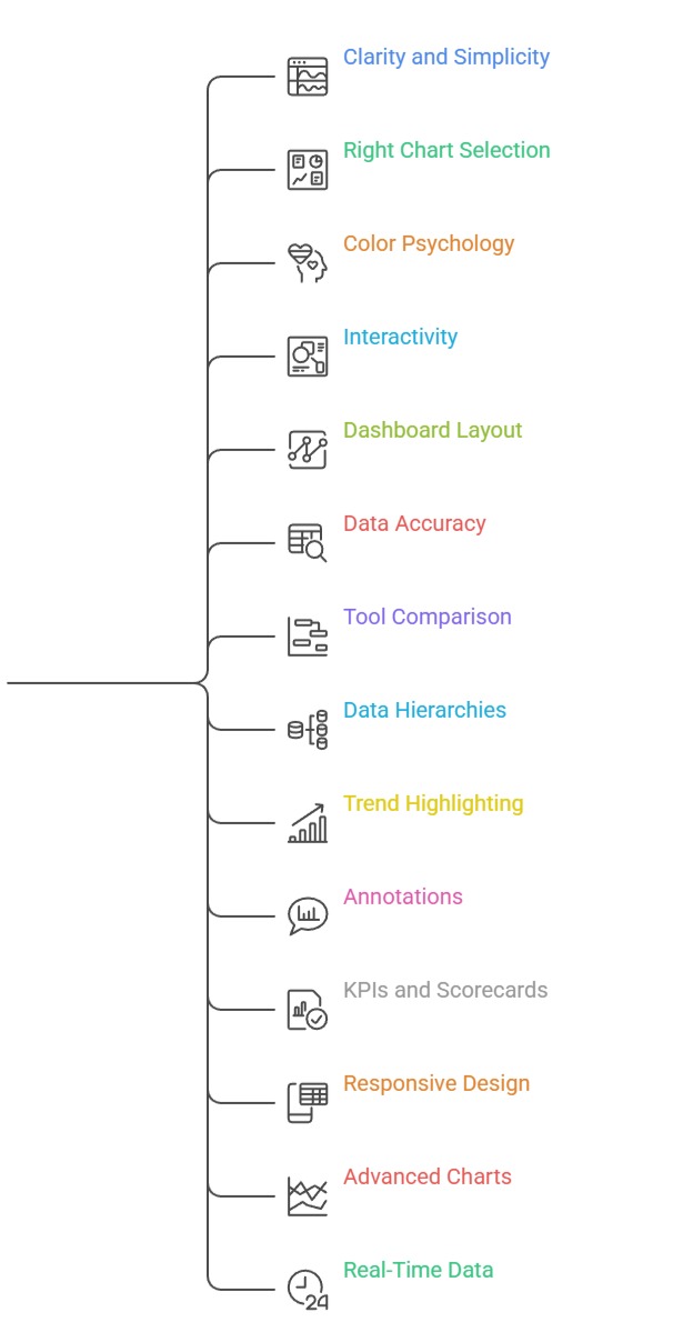
Data Visualization Principles and Best Practices for Marketing Analytics
1. Principle of Clarity and Simplicity
Clarity is the foundation of effective data visualization, ensuring that every element in the chart serves a purpose.
A clear visual avoids overcrowding, excessive text, unnecessary design elements, or confusing color combinations.
The goal is to emphasize the key message without distracting the audience with irrelevant details.
Marketers should choose chart types that naturally align with the structure of the data instead of forcing complex visuals.
Using consistent labels, readable fonts, and balanced spacing improves comprehension.
Clarity helps stakeholders grasp insights quickly and reduces misinterpretation. In marketing dashboards, simplicity ensures teams can focus on KPIs that actually matter.
2. Choosing the Right Chart for the Data
Selecting the appropriate chart ensures the data story is communicated effectively.
For Example, bar charts are best for comparisons, line charts for trends over time, and scatter plots for relationships.
Using the wrong chart type—such as a pie chart for too many categories can distort understanding.
Marketers should match visual design to analytical goals like comparing channels, analyzing product performance, or tracking funnel drop-offs.
Good chart selection reduces cognitive load and helps viewers interpret information instantly. With the right chart, patterns, trends, and anomalies become more visible.
This enhances decision-making and supports more accurate reporting.
3. Importance of Color Psychology and Consistency
Color is a powerful visual tool that guides attention, differentiates categories, and highlights important metrics.
Marketers must use color intentionally—such as red for alerts, green for positive performance, or blue for standard metrics.
Too many colors create noise, while too few limit interpretation.
Consistent color usage across dashboards helps viewers quickly recognize patterns without relearning meanings.
Accessibility is also important; palettes should be friendly to color-blind users.
In marketing analytics, color-coded ROAS ranges, heatmaps, and sentiment visuals rely heavily on color precision. Consistency builds trust and enhances readability across reports.
4. Interactivity and Drill-Down Capabilities in Modern Tools
Modern visualization tools allow marketers to interact with the data rather than viewing static graphs.
Features like filters, slicers, hover-tooltips, clickable charts, and drill-down paths enable deeper exploration.
This interactivity helps users uncover insights hidden beneath surface-level summaries, such as segment-wise performance or campaign-level breakdowns.
Drill-down capabilities allow marketing teams to go from high-level KPIs to detailed metrics instantly.
This reduces dependency on multiple reports and makes dashboards more actionable.
Interactive visuals support faster decisions and empower non-technical stakeholders to analyze data independently.
5. Dashboard Layout, Structure, and Storytelling
A well-organized dashboard guides the viewer’s eye from high-level insights to granular details.
Good storytelling involves arranging KPIs, charts, and filters in a logical flow—such as overview → trends → breakdowns → recommendations.
Placing the most important metrics at the top ensures they receive immediate attention. Grouping related visuals improves coherence and reduces clutter.
Storytelling in visualization helps stakeholders understand what happened, why it happened, and what actions should follow.
When dashboards follow a narrative structure, marketing teams experience fewer misunderstandings and make decisions with greater confidence.
6. Data Accuracy, Labelling, and Avoiding Misleading Charts
Accurate representation of data is essential for credibility in marketing analytics.
Misleading visuals such as truncated axes, distorted proportions, or exaggerated gradients can create false impressions.
Proper labeling, consistent scales, and realistic proportions ensure viewers interpret insights correctly.
Marketing teams must avoid manipulating visuals to exaggerate performance or hide weaknesses.
Accuracy builds trust, especially when presenting campaign results, ROI reports, or customer insights to management.
Clear labeling of values, units, time periods, and definitions prevents confusion.
Ethical visualization is becoming increasingly important in professional analytics.
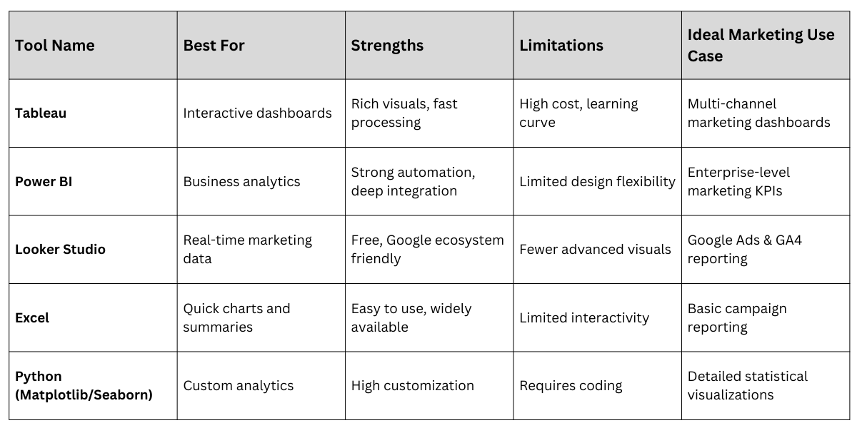
7. Comparing Visualization Tools and Their Use Cases
Different tools offer different strengths, and marketers must choose based on project requirements.
Tableau excels in interactive dashboards and beautiful visuals, while Power BI integrates deeply with business operations.
Looker Studio is ideal for real-time marketing data, especially from Google Ads and Analytics.
Excel remains reliable for quick charts, while Python libraries like Matplotlib and Seaborn provide customization for data scientists.
Understanding the strengths and limitations of each tool ensures efficient workflow.
With the right tool, marketing teams can automate reporting, reduce manual tasks, and analyze data faster.
8. Using Data Hierarchies and Aggregation for Better Interpretation
Data hierarchies help marketers organize information at different levels, such as region → country → state → city or campaign → ad group → ad.
Using aggregation ensures large datasets are summarized into meaningful levels before being visualized.
This prevents dashboards from becoming cluttered and makes it easier to identify trends at macro and micro levels.
When users can expand or collapse hierarchical layers, they gain control over the depth of insights they want to explore.
Aggregation also improves dashboard speed and ensures only relevant data is displayed.
This principle is especially useful in large digital marketing accounts, where thousands of ads or keywords exist.
Effective use of hierarchies enables smooth, structured storytelling.
9. Highlighting Trends and Seasonality in Marketing Data
Visuals must clearly indicate seasonal patterns, promotional spikes, or long-term trends that influence marketing performance.
Line charts, moving averages, and trendlines help marketers understand whether KPIs like conversions, CTR, or revenue are improving or declining.
Seasonality analysis is essential for industries like retail, travel, or food where customer behavior fluctuates across months.
Visual cues—such as trend indicators, upward/downward arrows, and color-coded phases—make these patterns easier to identify.
Highlighting these insights allows marketers to prepare campaigns ahead of seasonal peaks or dips.
Without trend visualization, teams risk making short-term decisions without understanding long-term behavior.
10. Enhancing Visuals with Annotations and Contextual Notes
Annotations help viewers understand the why behind the data by pointing out key events, spikes, or anomalies.
This could include marking Black Friday sales, campaign launches, promotions, or technical issues that affected performance.
Adding short notes directly on graphs reduces the need for lengthy explanations and makes insights instantly clear.
Annotations guide viewers toward the most important parts of the visual, improving storytelling and reducing misinterpretation.
In marketing reports, annotated visuals demonstrate analytical thinking and provide decision-makers with deeper context.
They also make dashboards more informative and self-explanatory for stakeholders.
11. Using KPIs, Scorecards, and Benchmark Indicators
KPI cards and scorecards are essential visualization components that provide quick-glance metrics such as CTR, CAC, ROAS, impressions, or revenue.
These visuals present the most important numbers prominently before viewers explore detailed graphs. Benchmark indicators—such as “above target,” “below target,” or percentage differences—help marketers evaluate performance instantly.
Color-coded KPI statuses improve understanding at a glance, especially in executive dashboards.
When used alongside charts, KPIs form the backbone of decision-making and help teams measure the success of campaigns against expectations.
Scorecards simplify complex datasets into concise, actionable insights.
12. Applying Responsive Design for Multi-Device Dashboard Viewing
Modern marketing dashboards are viewed across desktops, laptops, tablets, and mobile devices.
Responsive design ensures that visuals adjust seamlessly to different screen sizes without losing clarity.
Tools like Tableau, Power BI, and Looker Studio now offer device-specific layout options to ensure readability on the go.
Responsive dashboards allow marketing managers to monitor KPIs in real time during campaigns.
They are especially useful for performance marketers, sales teams, and digital agencies that need constant access to insights.
A well-designed responsive dashboard ensures stakeholders can make informed decisions anywhere and anytime. This supports faster reactions to performance changes.
13. Using Advanced Charts for Modern Marketing Analytics
Beyond basic line and bar charts, advanced visuals like heatmaps, cohort charts, funnel diagrams, treemaps, boxplots, and geographic maps offer deeper insights.
For Example, funnel charts show drop-offs at each stage of a customer journey, while heatmaps reveal engagement patterns by time and day.
Cohort charts help marketers analyze retention or repeat purchase behavior over time.
Geographic maps are useful for location-based marketing or regional performance analysis.
These charts provide granular, actionable insights that help tailor marketing strategies.
Advanced visuals are essential for teams working in e-commerce, app analytics, and omnichannel retail environments.
14. Real-Time Data Visualisation for Faster Marketing Decisions
Real-time dashboards allow marketers to track performance as it happens, enabling faster adjustments to campaigns.
These visuals help identify problems instantly—such as sudden increases in CPC, drops in conversions, or budget overspending.
Real-time analytics platforms like Looker Studio, Power BI streaming datasets, and Meta Ads dashboards are now widely used for time-sensitive campaigns.
They support automatic data refreshes and alert-based visualization. Real-time visuals empower marketers to react quickly, ensuring budget efficiency and improved outcomes.
This is especially important for campaigns running on tight timelines or competitive bidding environments.
Visualisation Tools

Class Sessions
Sales Campaign

We have a sales campaign on our promoted courses and products. You can purchase 1 products at a discounted price up to 15% discount.