Accessibility and usability are fundamental pillars of effective Business Intelligence (BI) design, ensuring that data insights are available to all users regardless of ability or background. Best design practices amplify these principles by creating intuitive, clear, and engaging visual analytics experiences.
When BI dashboards and reports incorporate accessibility and usability, organizations foster inclusiveness, increase adoption across diverse teams, and improve decision-making quality.
Accessibility in BI
Accessibility means designing BI tools and dashboards so that people with disabilities—visual, auditory, cognitive, or motor impairments—can perceive, navigate, and interact with data effectively without barriers.
It is closely linked to usability but specifically focuses on equity and compliance with standards such as WCAG (Web Content Accessibility Guidelines).
1. Use high-contrast color palettes to help users with low vision or color blindness distinguish information clearly.
2. Provide alt text descriptions for charts and visual elements so screen readers can convey insights to visually impaired users.
3. Enable keyboard navigation for users unable to use pointing devices, ensuring all interactive components are reachable by tabbing.
4. Design layouts with sufficient spacing and large touch targets for users with motor impairments.
Usability Principles in BI
Usability ensures BI systems are effective, efficient, and satisfying to use for their intended audience, regardless of skill level. Good usability reduces cognitive load and accelerates insight discovery.
1. Implement a clear typographical hierarchy with consistent fonts, sizes, and colors to distinguish titles, labels, and data points.
2. Maintain visual consistency across dashboards by using unified colors, iconography, and layout patterns.
3. Reduce visual noise and clutter by prioritizing key metrics and using whitespace strategically.
4. Provide interactive cues and instructions so users understand how to explore and filter data without confusion.
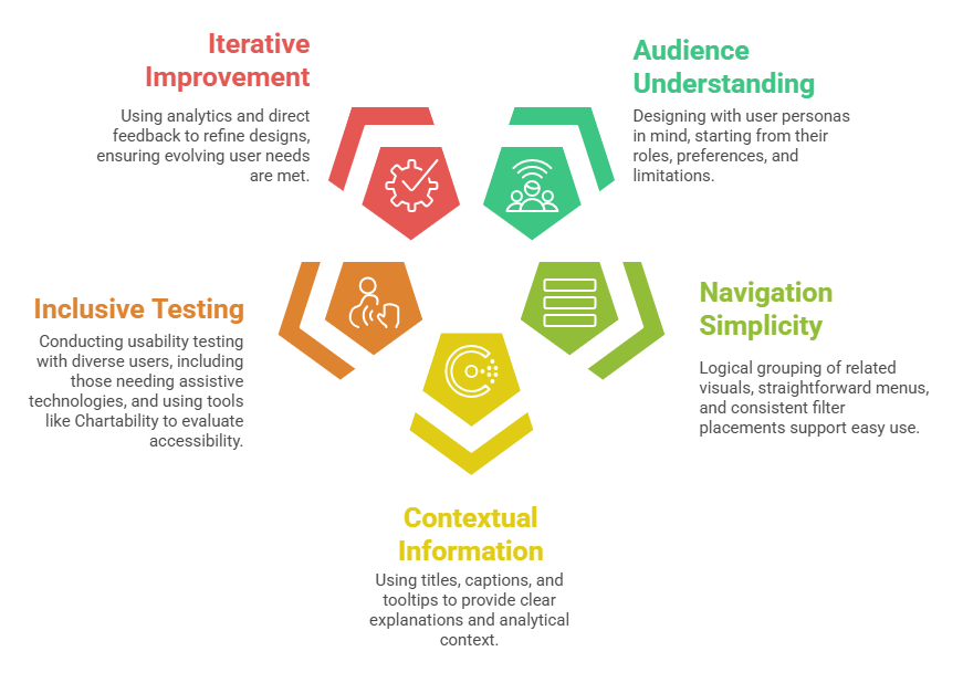
Best Design Practices
Combining accessibility and usability best practices results in BI visuals that are inclusive and impactful.
Integration of Accessibility and Usability
Accessibility and usability overlap significantly; good accessibility improves overall usability for all users, not just those with disabilities. For example, simple layouts and clear fonts aid users with cognitive challenges and enhance general comprehension.