Effective data visualization transforms complex data sets into clear, insightful, and engaging graphics that empower decision-makers. Good visualization goes beyond pretty charts; it communicates stories embedded within data, guiding viewers toward meaningful conclusions quickly and accurately.
This requires applying foundational principles that prioritize clarity, relevance, and accessibility while respecting the cognitive and perceptual characteristics of the audience. Understanding these principles ensures that data visualizations deliver truthful, actionable, and inclusive insights.
Know Your Audience and Purpose
The first fundamental step is understanding who will consume the visualizations and why. Tailor visuals to the needs, technical sophistication, and decision context of users:
1. Executives may need high-level dashboards with KPIs and trends.
2. Analysts often require granular, interactive visuals for exploration.
3. Public or external audiences benefit from simple, jargon-free visualizations with clear labels.
Defining the purpose clarifies what data to show and what story to tell, avoiding unnecessary complexity or distractions.
Choose the Right Visual Format
Selecting appropriate chart types depends on the nature of the data and the insights sought:
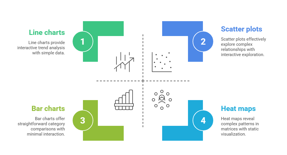
Matching visualization type to data and message improves comprehension and impact.
Prioritize Clarity and Simplicity
Simplicity drives clarity—the visualization should communicate key messages without clutter or ambiguity:
1. Limit the number of visual elements to avoid overwhelming viewers.
2. Use a clean layout with consistent spacing and alignment to guide the eye naturally.
3. Avoid unnecessary 3D effects or decorative embellishments that distort or distract.
4. Present data in logical order (e.g., highest to lowest, chronological).
Clear, minimalist design enhances the viewer's focus on insights.
Use Color and Contrast Intentionally
Color is a powerful tool, but must be applied with care to ensure accessibility and comprehension:
1. Use color palettes with sufficient contrast for readability, including for individuals with color vision deficiencies.
2. Avoid red-green color combinations that pose challenges for colorblind viewers.
3. Use color to highlight key insights or group related data, but avoid overuse.
4. Incorporate textures or patterns where needed to differentiate items without relying solely on color.
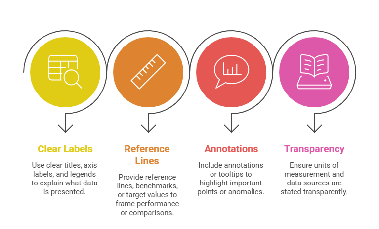
Provide Context and Labels
Contextual information ensures accurate interpretation and credibility:
Tell a Clear Story
Effective visualizations tell a coherent story that leads viewers through data logically and insightfully:
1. Structure visuals to provide an overview first, followed by details upon exploration.
2. Guide attention using visual hierarchy techniques—size, color intensity, position.
3. Use explanatory text or captions to emphasize conclusions or calls to action.
Storytelling increases engagement and ensures insight drives decision-making.
Ensure Accuracy and Integrity
Visualizations must faithfully represent data to maintain trust:
1. Use appropriate scales and axes to avoid misleading impressions (no truncated axes without a clear indication).
2. Avoid distorting proportions or omitting relevant data points.
3. Represent uncertainty or variability transparently when relevant.
4. Consistent data processing and visualization standards prevent bias and errors.
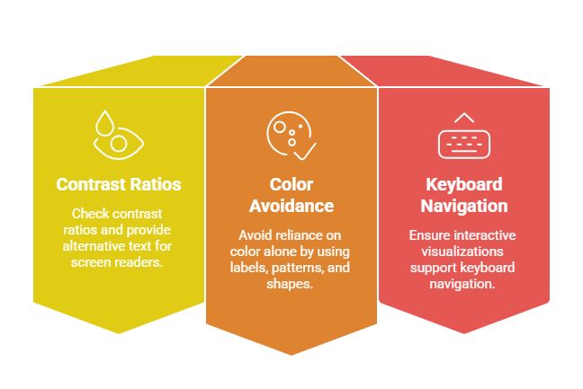
Design for Accessibility and Inclusivity
To reach broad audiences, designs must be accessible:
Inclusive visualization widens impact and complies with legal standards.
Continuous Testing and Improvement
Effective data visualization is iterative:
1. Test with real users to uncover usability issues or misinterpretations.
2. Collect feedback for clarity, color effectiveness, and interaction ease.
3. Refine based on analytics and evolving business needs.
Regular improvements ensure relevance and increase effectiveness.