Building a responsive portfolio site using HTML, CSS, and JavaScript allows developers to showcase their skills, projects, and experience in a professional and accessible way.
HTML provides the structure and content of the site, CSS handles layout, styling, and responsiveness across different screen sizes, and JavaScript adds interactivity and dynamic behavior.
A responsive design ensures the portfolio adapts smoothly to desktops, tablets, and mobile devices, improving usability and reach.
Planning Your Portfolio Structure
Before writing code, effective planning ensures your site is intuitive and scalable.
This step involves sketching layouts and defining content sections, setting the stage for responsive design.
A strong portfolio typically features key pages like Home, About, Projects, and Contact. Start by wireframing on paper or tools like Figma to visualize the mobile-first approach.
Key Sections to Include
Consider these essential components for a compelling portfolio:
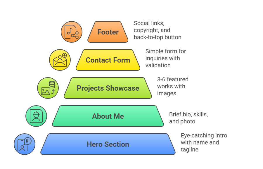
Use a mobile-first strategy: design for small screens first, then enhance for larger ones using media queries.
Content Inventory

This table helps prioritize high-impact elements.
Building the HTML Foundation
HTML provides the semantic structure, making your site accessible and SEO-friendly. We'll use modern elements like <section>, <article>, and <nav> for better organization.
Begin with a clean, semantic boilerplate. Include meta tags for responsiveness, like viewport settings.
<!DOCTYPE html>

<html lang="en">

<head>

    <meta charset="UTF-8">

    <meta name="viewport" content="width=device-width, initial-scale=1.0">

    <title>Your Name - Portfolio</title>

    <link rel="stylesheet" href="styles.css">

</head>

<body>

    <header>

        <nav><!-- Navigation --></nav>

    </header>

    <main><!-- Core content --></main>

    <footer><!-- Footer --></footer>

    <script src="script.js"></script>

</body>

</html>
Step-by-Step HTML Assembly
Follow this numbered process to build the skeleton:
Styling with Responsive CSS
CSS brings your design to life using Flexbox and Grid for layouts that flex across screen sizes.
Focus on custom properties (CSS variables) for maintainable, themeable styles.
Start with a reset and base styles in styles.css. Define variables like --primary-color: #3498db;.
Core Layout Techniques
1. Flexbox for Navigation: display: flex; justify-content: space-between; collapses to stacked on mobile.
2. CSS Grid for Projects: display: grid; grid-template-columns: repeat(auto-fit, minmax(300px, 1fr)); auto-adjusts columns.
3. Media Queries: Breakpoints at 480px (mobile), 768px (tablet), 1024px (desktop).
Responsive Navigation Example
.navbar {

    display: flex;

    justify-content: space-between;

    padding: 1rem 2rem;

}


@media (max-width: 768px) {

    .navbar {

        flex-direction: column;

        padding: 1rem;

    }

}
Viewport Units and Clamping for Typography
Use clamp() for fluid text: font-size: clamp(1.5rem, 4vw, 3rem);. This scales headings perfectly without breakpoints.
Adding Interactivity with JavaScript
JavaScript elevates your portfolio from static to dynamic, handling smooth scrolling, form validation, and animations.
Use vanilla JS for broad compatibility—no frameworks needed yet.
Target modern features like IntersectionObserver for scroll-triggered reveals.
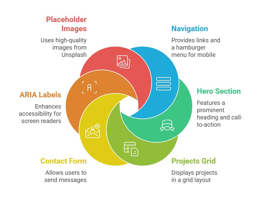
Essential JS Features
1. Smooth Scrolling: document.querySelectorAll('a[href^="#"]').forEach(anchor => {...});
2. Mobile Menu Toggle: Event listeners on hamburger icon.
3. Form Validation: Prevent submission on invalid inputs.
4. Project Filters: Buttons to show/hide categories (e.g., "Web", "Design").
Implementation Steps
1. Menu Toggle Function
const hamburger = document.querySelector('.hamburger');

const navLinks = document.querySelector('.nav-links');


hamburger.addEventListener('click', () => {

    navLinks.classList.toggle('active');

});
2. Animate on Scroll: Use IntersectionObserver to add .fade-in class when elements enter viewport.
3. Contact Form Handler: Validate email with regex /^[^\s@]+@[^\s@]+\.[^\s@]+$/, then simulate send with fetch().
These scripts keep file sizes under 5KB, ensuring fast loads.
Optimization and Best Practices
Polish your site for production with performance tweaks and cross-browser testing. Follow Core Web Vitals from Google for speed scores above 90.
1. Image Optimization: Use <img srcset> for responsive images; compress with TinyPNG.
2. Performance: Minify CSS/JS, lazy-load below-fold images (loading="lazy").
3. Accessibility: WCAG 2.2 compliance—contrast ratios >4.5:1, keyboard navigation.
4. Testing Tools: Chrome DevTools for emulation, Lighthouse for audits.
Deploy via GitHub Pages: Push to a repo, enable Pages in settings—live in minutes.
Deploying Your Portfolio
Final deployment makes your work public. Netlify offers drag-and-drop with free CDN.
1. Zip your files, upload to Netlify.
2. Custom domain optional via DNS.
3. Add analytics with Google Analytics snippet.
Your site now ranks in searches, attracting opportunities.

Class Sessions
Sales Campaign

We have a sales campaign on our promoted courses and products. You can purchase 1 products at a discounted price up to 15% discount.