Box model, positioning, and typography fundamentals form the foundation of CSS layout and visual design.
The box model explains how elements are sized and spaced using margins, borders, padding, and content, positioning controls where elements appear on the page, and typography focuses on readable, well-structured text.
Together, these concepts enable developers to create clean, responsive, and visually consistent web interfaces.
The CSS Box Model
Every HTML element generates a box in CSS, composed of content, padding, border, and margin.
Understanding this model prevents layout surprises and optimizes space usage. It's the foundation for Flexbox/Grid, which we'll cover later.
Breaking Down Box Components
The box model flows outward from content: padding (inner spacing), border (edge), and margin (outer spacing).

Visual Representation:
┌─────────────────────┐

│      Margin         │

├─────────────────────┤

│    Border         │ │

│ ┌─────────────────┐ │

│ │   Padding     │ │ │

│ │ ┌─────────────┐│ │ │

│ │ │  Content   ││ │ │

│ │ └─────────────┘│ │ │

│ └─────────────────┘ │

└─────────────────────┘
Box-Sizing Property (Modern Best Practice)
By default, box-sizing: content-box adds padding/border to your specified width, causing overflow. Switch to border-box for predictable sizing.
Apply Globally:
* {

    box-sizing: border-box;

}
Controlling Dimensions and Overflow
Set sizes thoughtfully to avoid breakage.
1. Width/Height: Use relative units like vw (viewport width), rem (root em), %.
2. Max-width/Min-width: Prevents expansion/shrinkage—max-width: 100%.
3. Overflow: overflow: hidden crops content; auto adds scrollbars.
Example: Responsive Card:
.card {

    width: 300px;

    max-width: 100%;

    padding: 1rem;

    border: 1px solid;

    overflow: hidden;

}
CSS Positioning
Positioning controls element placement relative to others or the viewport. Choose from static, relative, absolute, fixed, or sticky based on layout needs.
This powers overlays, navbars, and modals you'll build later.
The Five Positioning Values
Each value changes how top, right, bottom, left properties work.
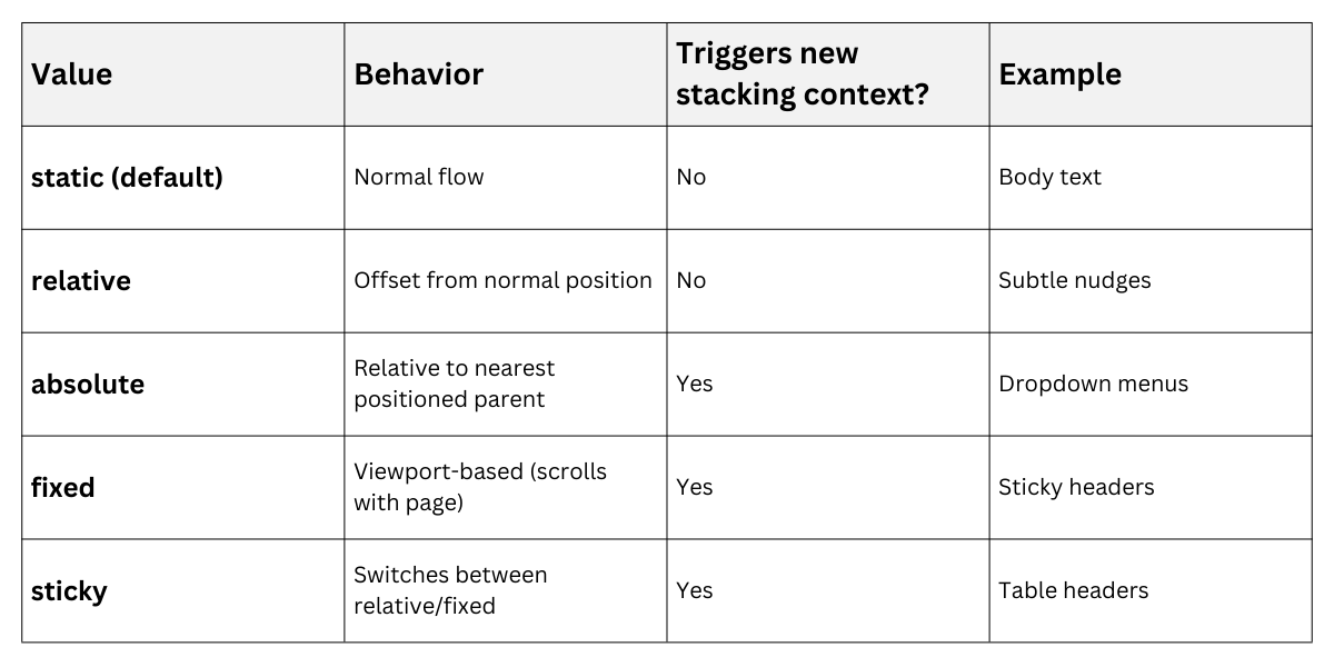
Pro Tip: Always declare position explicitly when using offsets.
Practical Positioning Examples
1. Centering with Absolute:
.hero {

    position: relative;

}

.hero-content {

    position: absolute;

    top: 50%;

    left: 50%;

    transform: translate(-50%, -50%);

}
2. Sticky Navigation:
.navbar {

    position: sticky;

    top: 0;

    z-index: 1000;

}
Z-index controls stacking order—higher values appear on top. Use sparingly (0-10 range) to avoid conflicts.
Common Pitfalls:
1. Forgetting position: relative on parent containers.
2. position: fixed breaking mobile scrolling (use position: sticky instead).
3. Overlapping: caused by missing margins.
Typography Fundamentals
Typography makes text readable and beautiful, influencing 95% of user interaction time. Control fonts, sizes, spacing, and alignment for hierarchy. Modern CSS prefers system fonts and variable units over pixel-perfect designs.
Font Properties and Stacks
Define font families with fallbacks, prioritizing web-safe/system options.
Best Practice Stack:
body {

    font-family: system-ui, -apple-system, sans-serif;

    font-size: 1rem; /* 16px base */

    line-height: 1.5;

}

h1 { font-size: clamp(2rem, 5vw, 4rem); }
1, font-weight: 300 (light) to 900 (black).
2. font-style: italic or normal.
3. text-decoration: underline, line-through.
Text Spacing and Alignment
Fine-tune readability with these properties.

Advanced: Container Queries
@container (min-width: 400px) {

    .card-title { font-size: 1.5rem; }

}
Practical Typography Hierarchy
Create visual flow matching your semantic HTML:
h1 { font-size: 2.5rem; margin-bottom: 0.5em; }

h2 { font-size: 2rem; border-bottom: 2px solid; }

p { margin: 1em 0; }
Example Output:
1. H1: Bold title pulls attention
2. H2: Section breaks guide eyes
3. Body: 1.5 line-height prevents fatigue
4. Test with browser: dev tools across devices.