Matplotlib
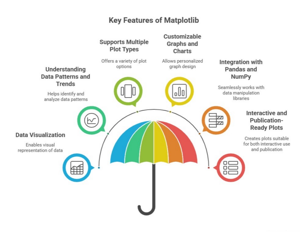
Matplotlib is a comprehensive and widely used open-source plotting library for the Python programming language. It provides tools for creating static, interactive, and animated visualizations in a variety of formats. Matplotlib allows users to generate high-quality graphs, charts, and plots, ranging from simple line and scatter plots to complex 3D visualizations.
At its core, Matplotlib works with Figures and Axes, where a Figure represents the entire plotting window or page, and Axes represent individual plots or subplots within that figure. It is highly customizable, giving users control over nearly every aspect of a plot, including colors, line styles, markers, fonts, labels, legends, and scales.
Matplotlib integrates seamlessly with NumPy arrays and Pandas DataFrames, enabling users to plot numerical and tabular data efficiently. It is often used in scientific computing, data analysis, machine learning, and research to visualize patterns, trends, and insights in datasets. Its versatility and compatibility with other Python libraries make it one of the most important tools for data visualization in Python.
Importance of Matplotlib in Data Analysis
Matplotlib is one of the most widely used Python libraries for data visualization. Its importance lies in its ability to transform raw data into meaningful, visual representations, enabling analysts, researchers, and organizations to understand complex datasets effectively. By converting numerical and structured data into charts and graphs, Matplotlib supports decision-making, insight generation, and communication of results across industries.
1. Effective Data Communication
Matplotlib allows analysts to convey information visually, making patterns, trends, and relationships in data easier to understand. Graphical representations such as line plots, bar charts, and scatter plots help stakeholders quickly grasp insights without needing to interpret raw numbers. This makes Matplotlib an essential tool for presentations, reports, and dashboards in business, research, and academic settings.
2. Customization and Flexibility
One of the key strengths of Matplotlib is its extensive customization options. Users can adjust colors, styles, fonts, labels, titles, and layouts to create precisely tailored visualizations. This flexibility allows analysts to highlight specific trends or anomalies, produce publication-quality graphics, and ensure that visualizations align with the audience’s needs and expectations.
3. Integration with Other Python Libraries
Matplotlib integrates seamlessly with libraries like Pandas, NumPy, and Seaborn, enabling analysts to visualize data directly after manipulation or computation. This integration ensures a smooth workflow from data preparation to visualization, reducing manual effort and improving efficiency in data analysis pipelines.
4. Support for Multiple Plot Types
Matplotlib supports a wide variety of plot types, including line charts, bar charts, scatter plots, histograms, pie charts, and 3D plots. This versatility allows analysts to choose the most appropriate visualization for different types of data and analysis objectives, facilitating better interpretation and insight extraction.
5. Interactive and Exploratory Analysis
Matplotlib supports interactive features such as zooming, panning, and real-time updates, which are particularly useful for exploratory data analysis (EDA). Analysts can explore datasets visually, detect outliers, understand distributions, and validate assumptions before applying statistical models or predictive algorithms.
6. Foundation for Advanced Visualization Libraries
Matplotlib serves as the foundation for other advanced Python visualization libraries, including Seaborn, Plotly, and Pandas’ plotting functions. These libraries build on Matplotlib’s core capabilities while adding higher-level functionality, demonstrating its central role in Python’s data visualization ecosystem.
7. Accessibility and Community Support
Being one of the oldest and most established Python visualization libraries, Matplotlib has extensive documentation, tutorials, and community support. Analysts can easily find examples, guides, and solutions to problems, making it accessible for beginners and experts alike. This broad support ensures that Matplotlib remains reliable and widely adopted in both academic and professional settings.
Matplotlib is important because it enables effective communication of data insights, provides extensive customization, supports diverse plot types, integrates with other libraries, facilitates exploratory analysis, and serves as a foundation for advanced visualization tools. Its versatility and accessibility make it a cornerstone for Python-based data analysis and visualization projects.
Uses of Matplotlib in Data Analysis
Matplotlib is a versatile library widely used for data visualization and exploratory analysis in Python. Its uses span multiple domains and workflows, making it an essential tool for analysts, researchers, and data scientists who need to translate raw data into actionable insights.
1. Data Visualization for Analysis
Matplotlib is primarily used to visualize data in various graphical formats such as line plots, bar charts, scatter plots, histograms, and pie charts. By creating visual representations of datasets, analysts can identify patterns, trends, correlations, and outliers that are not easily visible in raw numerical data. This enhances understanding and supports accurate interpretation of complex datasets.
2. Exploratory Data Analysis (EDA)
During exploratory data analysis, Matplotlib allows users to interactively explore data distributions and relationships between variables. Analysts can generate plots to detect anomalies, verify assumptions, and understand the underlying structure of data, which is crucial before performing statistical analysis or building predictive models.
3. Reporting and Presentations
Matplotlib is widely used to create high-quality charts and figures for reports, dashboards, and presentations. Its customization capabilities ensure that visualizations are publication-ready and tailored to the audience, making data-driven insights more understandable and impactful for stakeholders.
4. Comparison of Datasets
Analysts often use Matplotlib to compare multiple datasets or different variables within a dataset. By plotting multiple lines, bars, or histograms, users can observe differences, trends, and relationships effectively, which is helpful in business intelligence, market research, and scientific studies.
5. Time Series Visualization
Matplotlib is commonly used to plot time series data, such as stock prices, sensor readings, or sales trends over time. Analysts can create line graphs, area charts, or candlestick plots to observe patterns, detect seasonal effects, and make forecasts based on historical trends.
6. Statistical Analysis Support
Matplotlib is often combined with statistical libraries like SciPy or StatsModels to visualize statistical distributions, regression results, and correlations. This allows analysts to validate statistical models visually, check assumptions, and communicate statistical findings effectively.
7. Integration with Other Libraries
Matplotlib integrates seamlessly with libraries such as Pandas, NumPy, and Seaborn, allowing plots to be generated directly from dataframes or arrays. This integration simplifies workflows, enabling users to visualize data immediately after analysis or preprocessing without additional steps.
8. Interactive and Dynamic Visualizations
Matplb supports interactive features such as zooming, panning, and updating plots dynamically. These capabilities are particularly useful in exploratory or real-time analysis, where analysts need to interact with visualizations to gain deeper insights.
Need for Matplotlib in Data Analysis
Matplotlib is essential in data analysis because raw data alone is often insufficient to derive meaningful insights. Numerical tables and datasets can be overwhelming and difficult to interpret, making visualization a critical step for understanding trends, patterns, and relationships. Matplotlib fulfills this need by providing a comprehensive platform for creating clear, accurate, and customizable visual representations of data.
1.Simplifying Complex Data
Large datasets with multiple variables and records can be difficult to comprehend without visual representation. Matplotlib helps analysts simplify complex data by converting it into charts, graphs, and plots. This visualization allows for quick identification of trends, patterns, outliers, and correlations, making decision-making faster and more accurate.
2. Enhancing Communication of Insights
Data analysis is not only about generating results but also about communicating findings effectively to stakeholders. Matplotlib enables the creation of visualizations that convey insights clearly and intuitively, ensuring that even non-technical audiences can understand complex analytical results. This makes it a critical tool for reporting and presentations in business, research, and academic contexts.
3. Supporting Exploratory Data Analysis (EDA)
Before performing statistical modeling or predictive analysis, analysts need to explore and understand the dataset thoroughly. Matplotlib provides the necessary tools to visualize distributions, relationships, and trends, which helps validate assumptions, detect anomalies, and identify important variables. This reduces errors and improves the accuracy of subsequent analysis.
4. Facilitating Statistical and Comparative Analysis
Matplotlib allows analysts to compare datasets or visualize statistical measures such as means, medians, standard deviations, and correlations. By plotting multiple variables together, it becomes easier to observe differences, trends, and relationships, which is essential for research, quality control, and business intelligence.
5. Integrating with Python Data Ecosystem
Python’s data analysis ecosystem relies heavily on integration between libraries. Matplotlib integrates seamlessly with Pandas, NumPy, Seaborn, and SciPy, providing a unified workflow from data preparation to visualization. This integration is necessary for efficient, end-to-end data analysis and ensures that visualization remains an integral part of the analytical process.
6. Enabling Customization and Flexibility
Different datasets and analysis goals require customized visualizations. Matplotlib provides extensive options for customizing plot types, colors, labels, titles, and layouts. This flexibility is needed to highlight specific trends or anomalies and produce professional-quality graphics suitable for publications, dashboards, or presentations.
7. Interactive and Exploratory Capabilities
In addition to static plots, Matplotlib supports interactive features such as zooming, panning, and dynamic updates, which are necessary for exploratory data analysis. Interactive visualizations allow analysts to gain deeper insights, investigate anomalies, and explore datasets in real-time, improving understanding and decision-making.
The need for Matplotlib arises from its ability to simplify complex datasets, enhance communication, support exploratory and statistical analysis, integrate with Python libraries, provide customization, and enable interactive exploration. Without it, data analysis would be limited to raw numbers, reducing efficiency, interpretability, and the impact of insights derived from data.
Components of Matplotlib
Matplotlib is a powerful Python library used for creating static, animated, and interactive visualizations. It provides a flexible framework to generate plots, charts, and graphs with high customization. The library’s structure is built around key components that control different aspects of a plot. Understanding these components helps in creating clear and professional visual representations of data.
Matplotlib is a comprehensive Python library for creating static, interactive, and animated visualizations. It is widely used in data analysis, scientific research, machine learning, and reporting because it provides a flexible interface to build a variety of plots, charts, and figures. The library’s structure is based on a hierarchy of objects that allow precise control over every element of a plot. Understanding its core components is essential for creating professional and customizable visualizations.
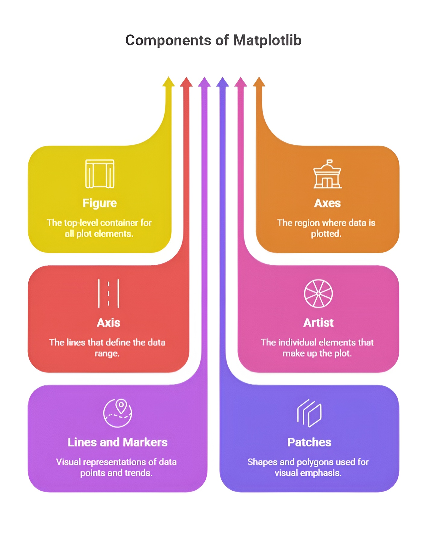
1. Figure
The Figure is the top-level container in Matplotlib and represents the entire drawing canvas. It serves as a container for all plot elements, including one or more Axes, titles, legends, and annotations. A Figure also defines the overall size, resolution, and background of the visualization. Figures can be created using plt.figure() for standalone plots or plt.subplots() when one or more Axes are needed. Even if no Axes are added, the Figure exists as the container for all future plot elements, allowing for structured and organized visualizations.
Example:
import matplotlib.pyplot as plt
fig = plt.figure(figsize=(8, 6))
plt.show()
2. Axes
The Axes is the region within the Figure where data is plotted. Each Axes contains its own X-axis and Y-axis, labels, ticks, and the plotting area where visual elements like lines, markers, bars, or other graphical representations appear. A single Figure can contain multiple Axes, which facilitates subplots or complex figure layouts. Axes are created using fig.add_subplot() or plt.subplots(), and all plot elements, labels, and titles are applied to this object.
Example:
fig, ax = plt.subplots()
ax.plot([1, 2, 3], [4, 5, 6])
ax.set_title('Sample Plot')
ax.set_xlabel('X-axis')
ax.set_ylabel('Y-axis')
plt.show()
3. Axis
Each Axes contains one or more Axis objects, defining the coordinate system and scaling of the plot. The X-axis and Y-axis are responsible for tick locations, tick labels, and the limits of the data displayed. Axis objects can be customized using methods such as set_xlim(), set_ylim(), set_xticks(), and set_yticks(). Proper customization of Axis ensures clarity and accurate representation of the data within the plot.
Example:
ax.set_xlim(0, 5)
ax.set_ylim(0, 10)
ax.set_xticks([0, 1, 2, 3, 4, 5])
ax.set_yticks([0, 2, 4, 6, 8, 10])
plt.show()
4. Plot Elements
Plot elements are the graphical components within an Axes that visually represent the data. They include lines, markers, text, legends, grids, and patches such as rectangles or circles. Each element can be customized in terms of color, line style, marker type, transparency, and annotations. Plot elements are added using functions like plot(), scatter(), bar(), hist(), and text(). Proper use of plot elements enhances readability and interpretability of the visualization.
Example:
ax.plot([1, 2, 3], [4, 5, 6], color='red', linestyle='--', marker='o', label='Line 1')
ax.legend()
plt.show()
2. Basic Plotting
Basic plotting in Matplotlib involves creating simple visualizations like line plots, bar charts, and scatter plots using functions such as plot(), bar(), and scatter(). You can customize these plots with titles, labels, colors, and markers to make the data more readable. It provides a straightforward way to visualize trends, patterns, and relationships in datasets. Overall, basic plotting forms the foundation for more advanced and interactive visualizations in Matplotlib.
1. plt.plot() for Line Graphs
The plt.plot() function is the fundamental tool in Matplotlib for creating line graphs. It is used to plot data points connected by straight lines, which makes it ideal for visualizing trends over a sequence, such as time series or continuous data. By default, plt.plot() draws a blue line connecting the points provided in the X and Y data arrays. It is simple to use and provides options for customizing the line style, color, and markers to make the plot more informative and visually appealing.
Example:
import matplotlib.pyplot as plt
x = [1, 2, 3, 4, 5]
y = [2, 4, 6, 8, 10]
plt.plot(x, y)
plt.show()
2. Plotting Multiple Lines in One Graph
Matplotlib allows multiple lines to be plotted on the same axes to compare different datasets. This can be done by calling plt.plot() multiple times before displaying the figure with plt.show(). Each line can have its own style, color, and marker, allowing clear distinction between datasets. Plotting multiple lines in one graph is useful for visual comparisons and trend analysis.
Example:
x = [1, 2, 3, 4, 5]
y1 = [2, 4, 6, 8, 10]
y2 = [1, 3, 5, 7, 9]
plt.plot(x, y1, label='Line 1')
plt.plot(x, y2, label='Line 2')
plt.show()
3. Adding Titles, Labels, and Legends
Titles, axis labels, and legends are essential for making plots understandable and informative. The plt.title() function adds a title to the plot, while plt.xlabel() and plt.ylabel() define the labels for the X-axis and Y-axis respectively. Legends, created with plt.legend(), provide context for multiple lines or datasets within the same plot, helping viewers interpret the graph correctly.
Example:
plt.plot(x, y1, label='Line 1')
plt.plot(x, y2, label='Line 2')
plt.title('Comparison of Two Lines')
plt.xlabel('X-axis')
plt.ylabel('Y-axis')
plt.legend()
plt.show()
4. Customizing Line Styles, Colors, and Markers
Matplotlib offers extensive customization options for lines, markers, and colors to enhance the readability and aesthetics of a plot. Line style can be controlled with parameters like '-', '--', ':', or '-.'. Colors can be specified using names, RGB codes, or abbreviations such as 'r' for red and 'g' for green. Markers, which indicate individual data points, can be set using symbols like 'o', 's', '^', or 'x'. Combining these options allows each line or dataset to be visually distinct and easily interpretable.
Example:
plt.plot(x, y1, color='red', linestyle='--', marker='o', label='Line 1')
plt.plot(x, y2, color='green', linestyle=':', marker='s', label='Line 2')
plt.title('Customized Lines')
plt.xlabel('X-axis')
plt.ylabel('Y-axis')
plt.legend()
plt.show()
3. Scatter Plots
Scatter plots in Matplotlib are used to visualize the relationship between two numerical variables by plotting data points on a Cartesian plane. Each point represents a pair of values, making it easy to observe correlations, clusters, or outliers. Matplotlib allows customization of markers, colors, sizes, and labels to enhance readability and interpretation. Overall, scatter plots are an essential tool for exploring and understanding patterns in data.
1. Creating Scatter Plots using plt.scatter()
Scatter plots are used to visualize the relationship between two sets of numerical data by plotting points on the X and Y axes. In Matplotlib, the plt.scatter() function is used to create scatter plots. Each point in the plot represents a pair of values from the datasets, allowing for identification of patterns, clusters, and correlations. Scatter plots are particularly useful for analyzing the distribution and relationship between variables in exploratory data analysis.
Example:
import matplotlib.pyplot as plt
x = [1, 2, 3, 4, 5]
y = [5, 7, 4, 6, 8]
plt.scatter(x, y)
plt.show()
2. Adjusting Marker Size and Color
Matplotlib allows customization of markers in scatter plots to make data points more visually distinguishable. The size of each marker can be adjusted using the s parameter, while the color can be set using the c parameter. These customizations help highlight specific points or groups of points and improve the clarity of the visualization.
Example:
plt.scatter(x, y, s=100, c='red')
plt.show()
3. Using Color Maps (cmap)
When dealing with large datasets or additional variables, color maps can be used to represent a third dimension of data in scatter plots. The cmap parameter assigns colors to points based on another variable’s values, providing a visual cue about its magnitude or category. Matplotlib offers various predefined color maps like 'viridis', 'plasma', 'coolwarm', and 'rainbow'.
Example:
values = [10, 20, 30, 40, 50]
plt.scatter(x, y, c=values, s=100, cmap='viridis')
plt.colorbar() # Shows the color scale
plt.show()
4. Adding Titles, Labels, and Legends
Just like line plots, scatter plots also benefit from titles, axis labels, and legends to enhance readability. Titles are added with plt.title(), X-axis and Y-axis labels with plt.xlabel() and plt.ylabel(). When multiple scatter datasets are plotted together, plt.legend() is used to differentiate them and provide context for the visualized data.
Example:
plt.scatter(x, y, c=values, s=100, cmap='plasma', label='Data Points')
plt.title('Scatter Plot Example')
plt.xlabel('X-axis')
plt.ylabel('Y-axis')
plt.legend()
plt.colorbar()
plt.show()
4. Bar Charts
Bar charts in Matplotlib are used to represent categorical data with rectangular bars, where the height or length of each bar corresponds to the value of the category. They help compare quantities across different groups or track changes over time. Matplotlib allows customization of bar colors, width, labels, and orientation (vertical or horizontal) for better visualization. Overall, bar charts are an effective way to display and compare discrete data visually.
1. Vertical Bar Charts with plt.bar()
Vertical bar charts are used to represent categorical data with rectangular bars where the height of each bar corresponds to the value of the category. In Matplotlib, vertical bar charts are created using the plt.bar() function. The X-axis represents the categories, while the Y-axis represents the values. Vertical bar charts are useful for comparing values across different categories in a clear and visual manner.
Example:
import matplotlib.pyplot as plt
categories = ['A', 'B', 'C', 'D']
values = [5, 7, 3, 8]
plt.bar(categories, values)
plt.show()
2. Horizontal Bar Charts with plt.barh()
Horizontal bar charts are similar to vertical bar charts but are oriented horizontally. The categories are plotted along the Y-axis, and the values are represented by the length of the bars along the X-axis. Horizontal bar charts are particularly useful when category labels are long or when comparing many categories, as they improve readability. They are created using the plt.barh() function.
Example:
plt.barh(categories, values)
plt.show()
3. Customizing Bar Colors, Widths, and Patterns
Matplotlib allows extensive customization of bars to improve visual appeal and highlight differences between categories. The color of the bars can be changed using the color parameter, while the width of vertical bars or height of horizontal bars can be controlled using the width parameter. Patterns or hatching can be added to bars using the hatch parameter. These customizations help make charts more informative and visually distinct.
Example:
plt.bar(categories, values, color='skyblue', width=0.5, hatch='/')
plt.show()
4. Adding Labels and Titles
Titles, axis labels, and annotations enhance the clarity and interpretability of bar charts. The chart title is added using plt.title(), while plt.xlabel() and plt.ylabel() define the axes. Values can also be annotated on top of bars for more precise interpretation. Legends are useful when multiple datasets are plotted on the same chart to differentiate them.
Example:
plt.bar(categories, values, color='orange', label='Category Values')
plt.title('Vertical Bar Chart Example')
plt.xlabel('Categories')
plt.ylabel('Values')
plt.legend()
plt.show()
5. Histograms
Histograms in Matplotlib are used to represent the distribution of a numerical dataset by dividing the data into bins and displaying the frequency of values in each bin as bars. They help understand data patterns, spread, and skewness. Matplotlib allows customization of the number of bins, colors, labels, and range for clearer visualization. Overall, histograms are essential for exploring the underlying distribution of data in a graphical form.
1. Creating Histograms using plt.hist()
Histograms are used to visualize the distribution of a dataset by dividing the data into intervals, called bins, and counting the number of data points in each bin. In Matplotlib, histograms are created using the plt.hist() function, which automatically calculates the frequency of values within each bin and plots it as a series of contiguous bars. Histograms are especially useful for understanding the spread, central tendency, and skewness of numerical data.
Example:
import matplotlib.pyplot as plt
data = [1, 2, 2, 3, 3, 3, 4, 4, 5, 5, 5, 5]
plt.hist(data)
plt.show()
2. Choosing Number of Bins
The number of bins determines the granularity of the histogram. Too few bins may oversimplify the data, while too many bins can make the distribution appear noisy. Matplotlib allows specifying the number of bins using the bins parameter. Choosing an appropriate bin size depends on the dataset and the level of detail required for analysis.
Example:
plt.hist(data, bins=5)
plt.show()
3. Density Plots vs. Frequency Plots
By default, histograms display the frequency of data points within each bin. However, they can also be normalized to show a probability density instead of raw counts. Setting the density=True parameter converts the histogram into a density plot, which is useful for comparing distributions across datasets of different sizes. Density plots represent the proportion of data points relative to the total dataset, making them suitable for probability-based analysis.
Example:
plt.hist(data, bins=5, density=True)
plt.show()
4. Customizing Histogram Colors and Styles
Histograms can be visually enhanced by customizing the color, edge color, transparency, and bar style. The color parameter sets the fill color of the bars, edgecolor defines the outline, and alpha controls transparency. Combining these customizations allows for clearer, more appealing, and easier-to-interpret visualizations.
Example:
plt.hist(data, bins=5, color='green', edgecolor='black', alpha=0.7)
plt.title('Histogram Example')
plt.xlabel('Data Values')
plt.ylabel('Frequency')
plt.show()
6. Pie Charts
1. Creating Pie Charts with plt.pie()
Pie charts are circular charts used to represent the proportion of different categories within a whole. Each slice of the pie corresponds to a category, with the size of the slice proportional to its value. In Matplotlib, pie charts are created using the plt.pie() function, which takes a list of values representing the relative sizes of each category. Pie charts are ideal for displaying percentage distributions and understanding the composition of datasets.
Example:
import matplotlib.pyplot as plt
sizes = [25, 30, 20, 25]
labels = ['A', 'B', 'C', 'D']
plt.pie(sizes, labels=labels)
plt.show()
2. Exploding Sections for Emphasis
Matplotlib allows specific slices of a pie chart to be “exploded” or separated from the center to highlight particular categories. This is done using the explode parameter, which takes a list of offsets corresponding to each slice. Exploding sections is useful when you want to draw attention to a significant or interesting portion of the data.
Example:
explode = [0, 0.1, 0, 0] # Only second slice is exploded
plt.pie(sizes, labels=labels, explode=explode)
plt.show()
3. Adding Labels, Percentages, and Legends
Labels indicate the category names on the pie chart, while percentages display the proportion of each category relative to the whole. The autopct parameter allows formatting of percentages, and a legend can be added using plt.legend() to improve clarity. These features make pie charts more informative and easier to interpret.
Example:
plt.pie(sizes, labels=labels, autopct='%1.1f%%')
plt.title('Pie Chart Example')
plt.legend()
plt.show()
4. Customizing Colors and Shadows
Pie charts can be customized with different colors for each slice using the colors parameter, and a shadow can be added for a 3D effect using shadow=True. Additional customization options like start angle (startangle) and counterclockwise rotation allow precise control over the appearance of the chart. These enhancements improve visual appeal and readability.
Example:
colors = ['gold', 'lightblue', 'lightgreen', 'pink']
plt.pie(sizes, labels=labels, colors=colors, shadow=True, startangle=90, autopct='%1.1f%%')
plt.title('Customized Pie Chart')
plt.show()

Class Sessions
1- Introduction to Python
2- Basic Syntax and Variables
3- Basic Input & Output
4- Control Flow Statements
5- Understanding Data & Data Analysis
6- Python for Data Analysis
7- NumPy Arrays
8- Numerical Computations in Numpy
9- Series & DataFrames in Pandas
10- Advanced Indexing and Selection in Pandas
11- Introduction to Matplotlib
12- Advanced Matplotlib Topics
13- Introduction to Scipy in Python
14- Advanced Scipy Topics